2024 — my 41st on this earth and Nephew’s tenth. It’s a significant milestone for us.
Ten years ago, Neil and I set out to create a design studio that did good, honest design work, for people who respect our perspective and opinions, and trust us to help them become more successful.
Along the way, we’ve grown, shrunk, and then evened out, but we remain a small, agile, and tenacious studio.
2024 was a typical year. It provided its own set of challenges and opportunities. A year of change, but also of consistency.
So here’s our chronological review of 2024. From beginning to end.
January
Retainers and Rebrands
The first days back from the welcome refreshing break of Christmas and New Year often goes one of two ways:
1. Slow — our partners are still in party mode and forget that life goes on after too many mince pies and glasses of Bucks Fizz;
2. Hectic — It’s almost as if a two-week break has gone on for two months and everyone's panicking that, this, that, or the other, has not been done!
For 2024, it was the latter.
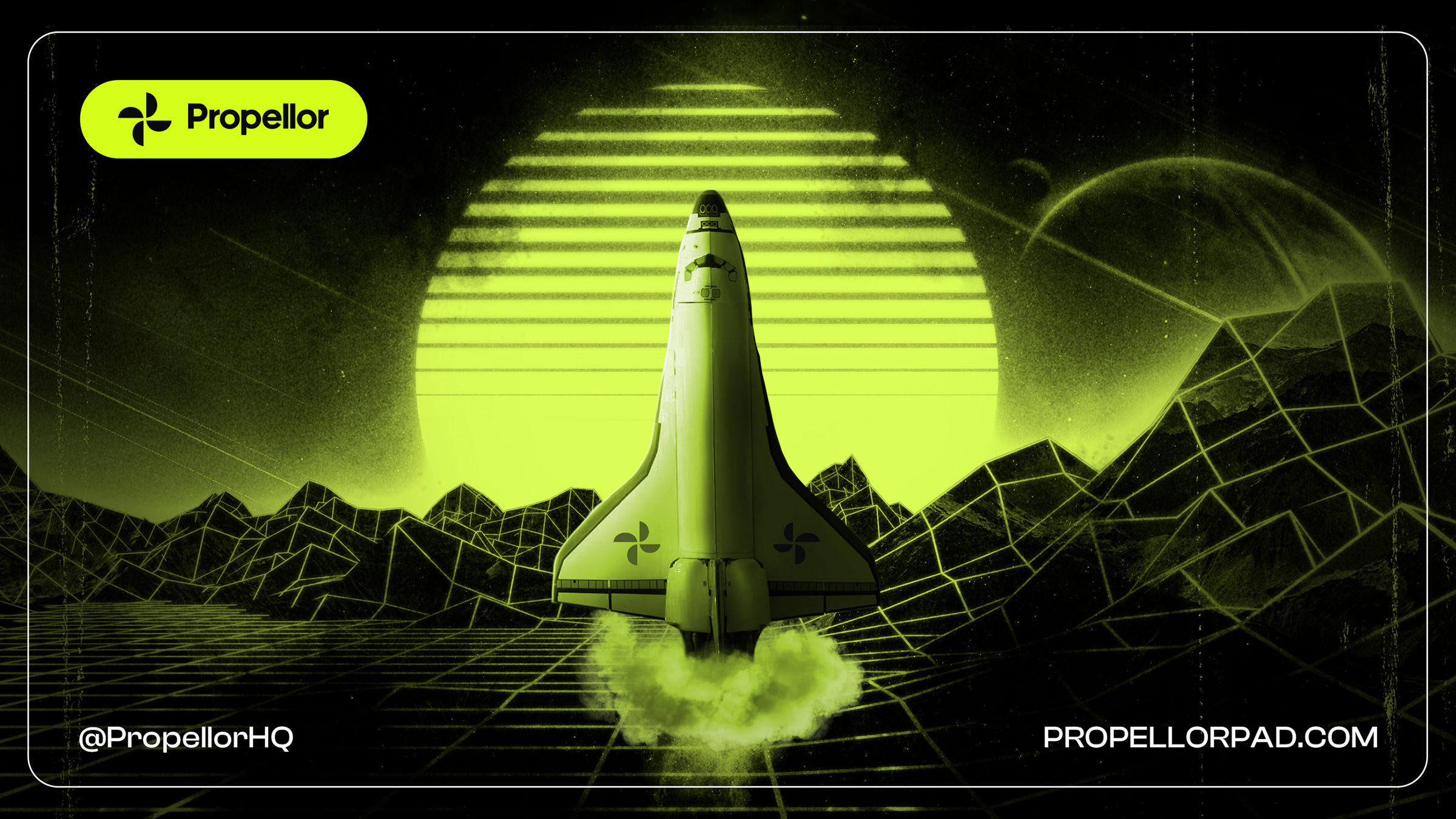
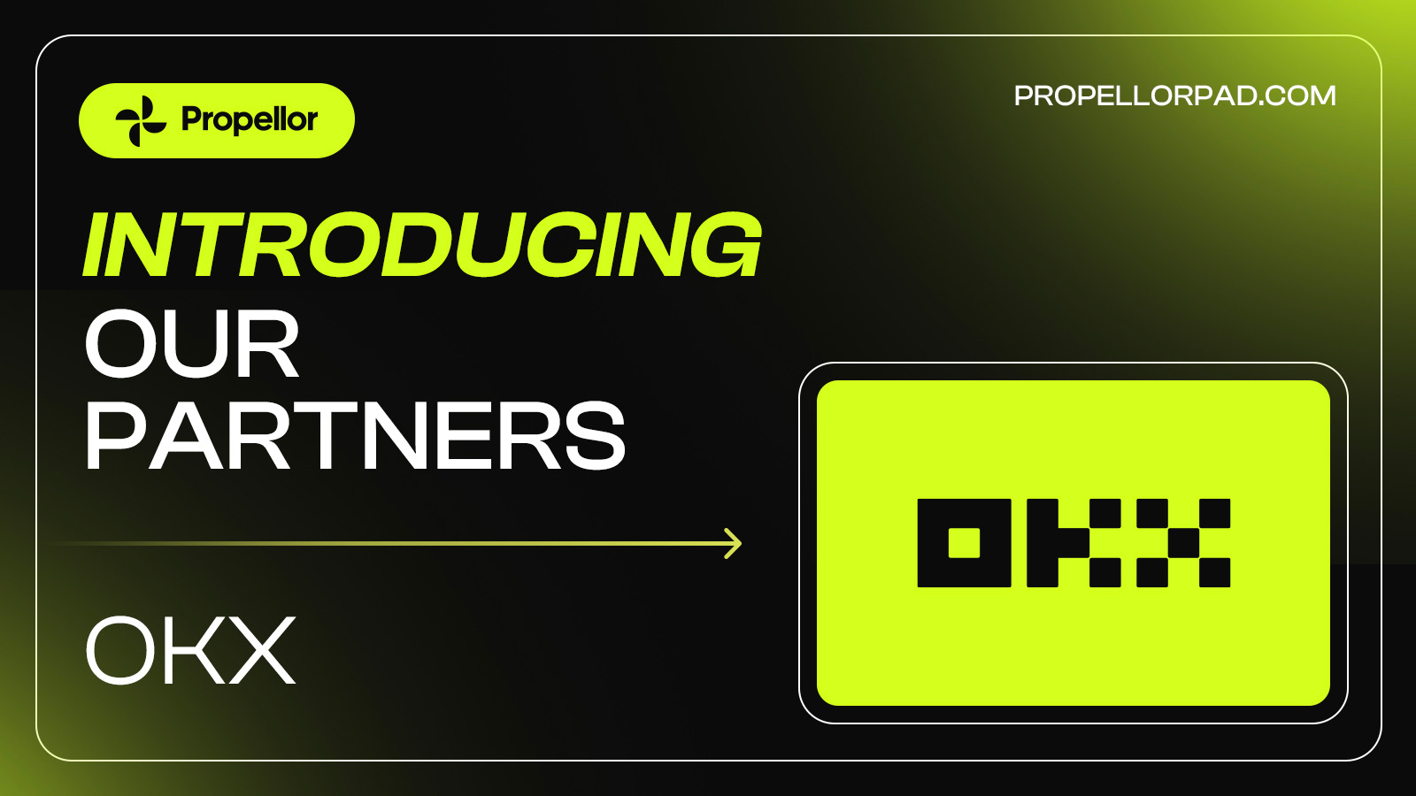
Propellor
We engaged in a new short-term creative retainer with crypto launchpad Propellor, creating a range of static and animated graphic assets for social media and digital platforms. Chris (Hinton - more of him later) got to work creating graphics for Twitter (we hadn’t got used to ‘X’ yet) to support their launch, introduce partners, and promote offers. The engagement lasted until around June time when Propellor hired alternative resource to be closer to their marketing team.
It was an interesting engagement for us. When many agencies were launching ‘subscription-based’ services — Netflix for design, if you will — here was us, trying to buck the trend but effectively offering a pay-per-month, scope-based retainer. It certainly worked for us in the short-term but I do still wonder whether the value is there for both parties. The retainer was based on fairly minimal contact. The client would send the brief for the design task and we would take the baton and create something based on minimal input.
The beauty of the traditional studio model is that it fosters better relationships. Relationships where people can be themselves and value each other's input. For me, this is lost when the process is purely transactional. It didn’t necessarily result in below-standard work; but it didn’t create a long-lasting and strong bond. Don’t get me wrong, Ben at Propellor was a great guy and fully backed us to the hilt. But it was no surprise when the retainer wasn’t renewed past the original 6 month plan. But, as we always say: we ‘stretch to grow’.
Ditto
Talking of strong relationships. We continued to spin out branded social graphics for another valued partner in Ditto. But before I wax lyrical here, it’s worth noting that we also lost the Ditto retainer during 2024. This time, purely down to underuse of resource. We still have a great relationship with Head of Ditto, Matt Dodds.


Carpigiani
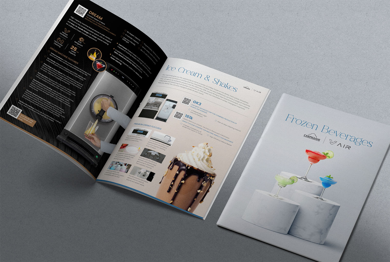
One fallover from 2023 that we worked on in Jan 2024 was a dedicated brochure for a specific division of luxury dessert machine manufacturer, Carpigiani. Chris and I bashed heads to create a new short-form brochure that aimed to elevate their Frozen Beverages range (think cocktails, shakes, smoothies, and slushies). Thank goodness we worked on this in a cold January, instead of a beautifully sunny July. Probably would have been a little more challenging.
Wild Squirrel
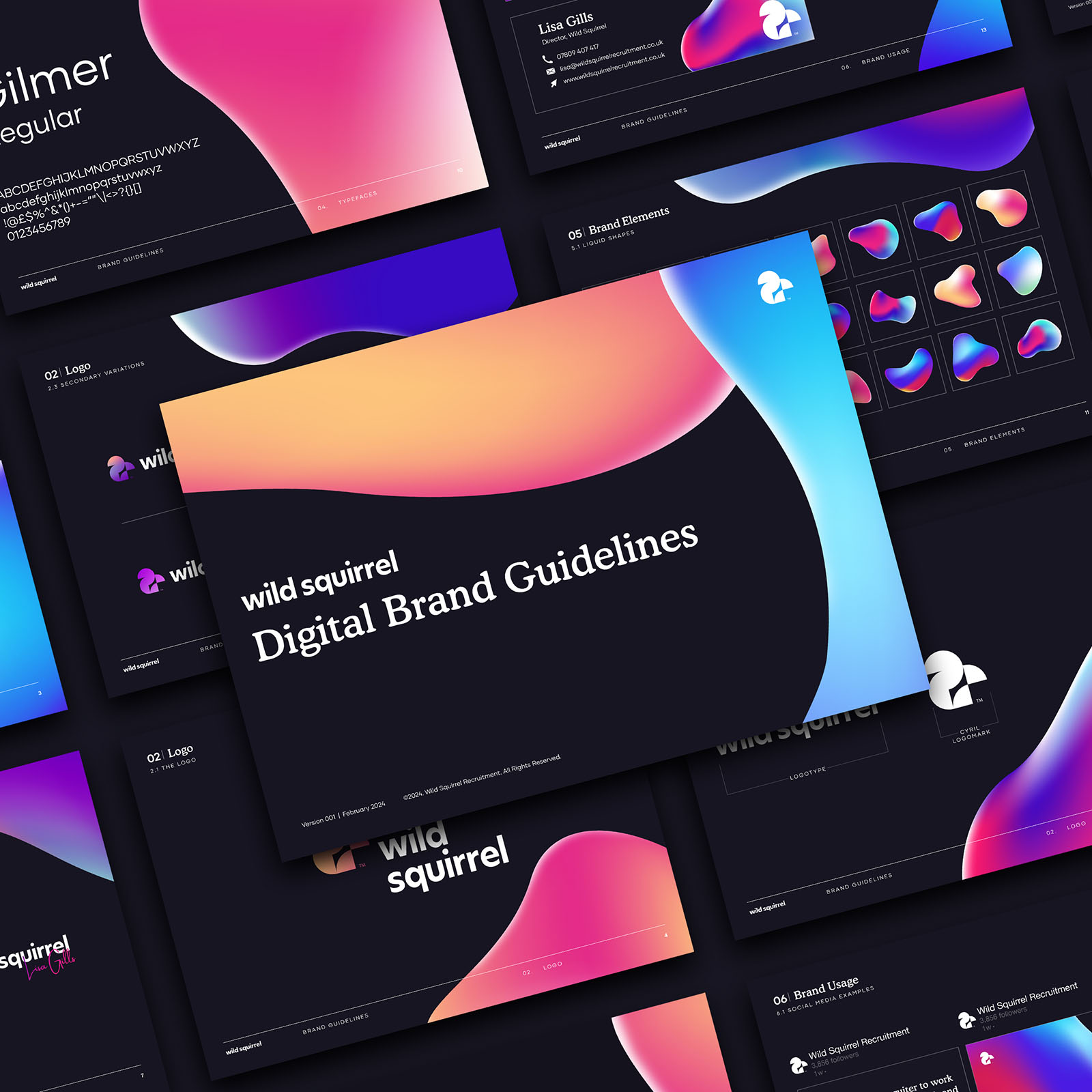
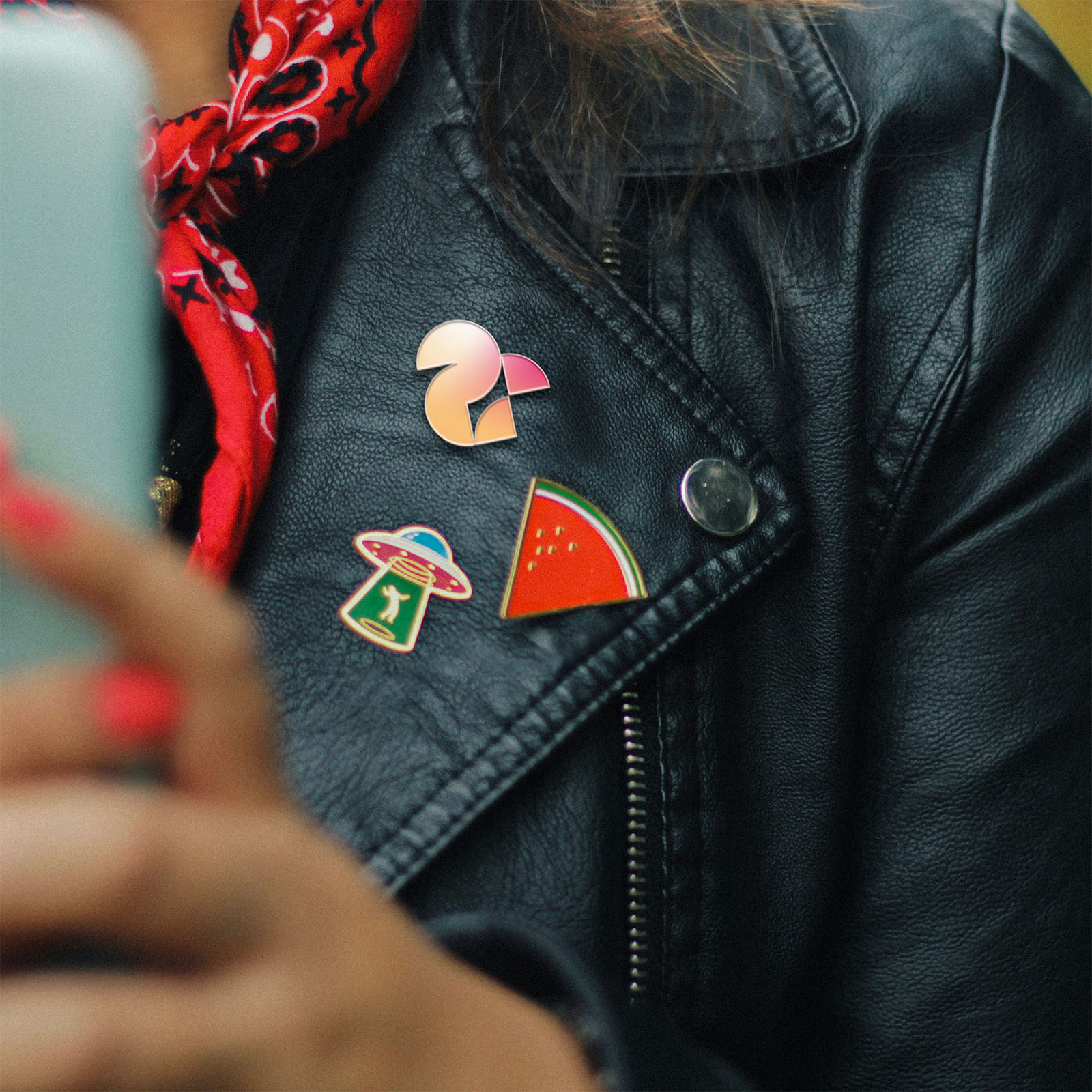
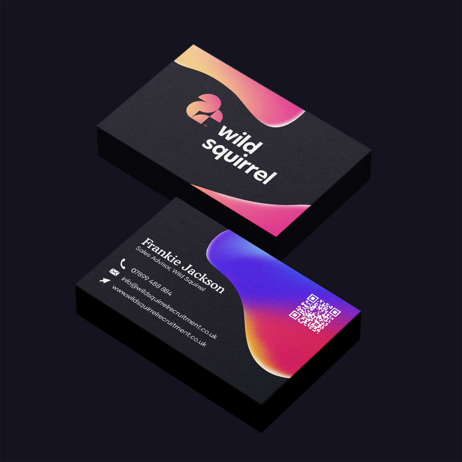
We also embarked on our first rebrand of the year in the form of recruitment agency, Wild Squirrel. Obtained via a recommendation by a mutual contact, Wild Squirrel already had a mascot-based brand mark that they didn’t want to part with (say hi to Cyril), so the challenge here was to expand the rest of the visual identity. Lisa, the founder of Wild Squirrel, is all about colour and energy, so our focus was on bringing the identity to life. So clearly, organic-inspired blobs undulating with colour was the only choice! We overhauled the colour palette and introduced a more playful and welcoming typography system with Cooper as the hero of the piece. Wild and Squirrel indeed.

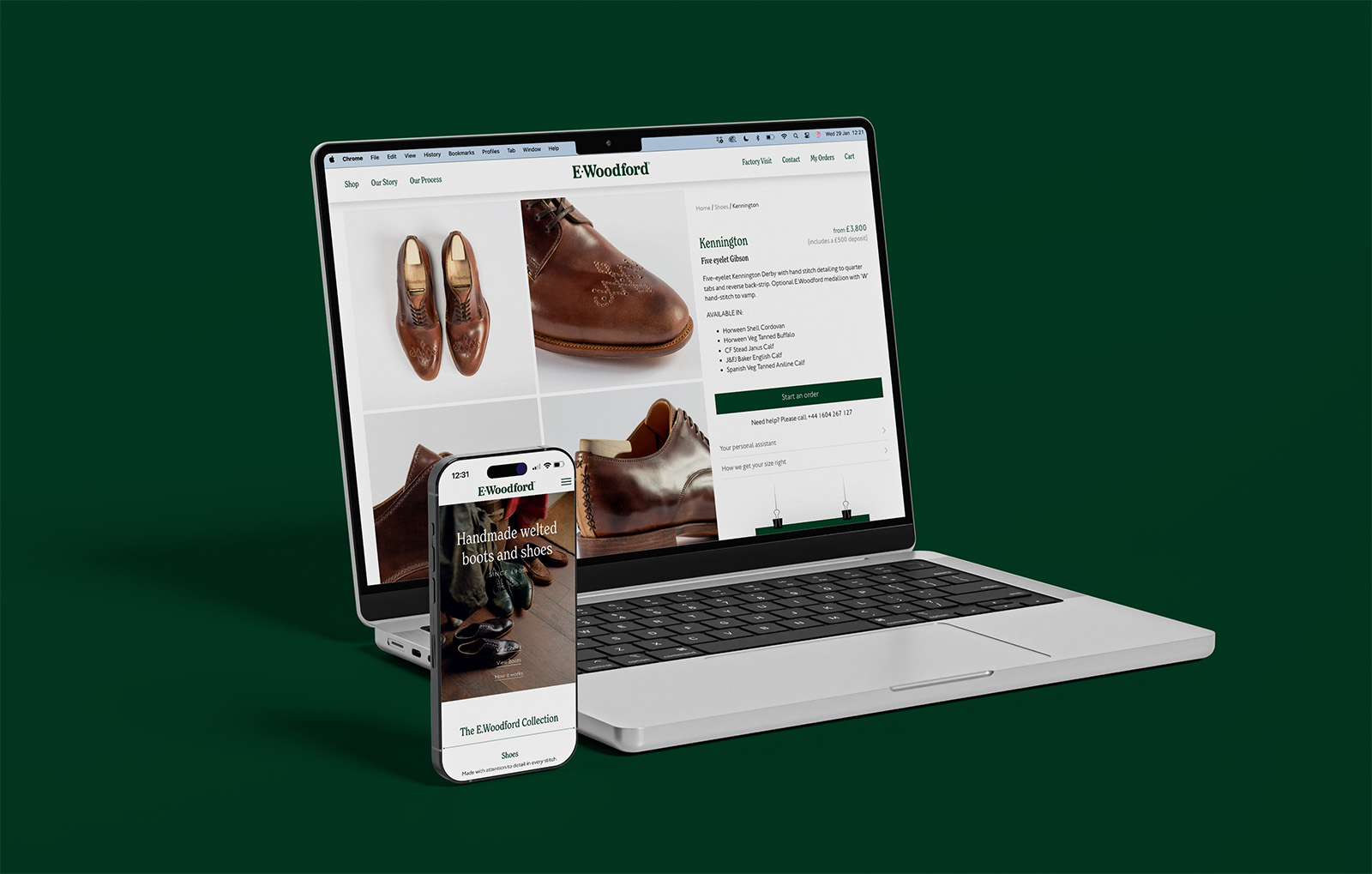
E.Woodford
Our biggest challenge of the month was delivering our design system for new luxury shoe manufacturer and online retailer - E.Woodford. Months in the planning, this was a big one that brought every member of the team together.
Throughout 2023, we’d worked on the initial brand identity and positioning for E.Woodford (big ol’ case study coming soon). They make custom, hand-welted shoes that are priced in the thousands and sold solely online — which is a bit of a non-standard approach. Usually, we’d spin up a Shopify, Woocommerce or Webflow commerce site, build a custom theme, add product data and off-we-go to watch the pounds pile in. Except, we had to design something where the main customer consideration was: “Wait, so I can go on the internet, choose a style of boot or shoe, then I can choose what material it’s made from, the colour, find a size that’ll definitely fit my feet, it’ll cost a few thousand quid and take about 3 months before I get them?”
Yeah, it was a challenge. But, my god, we jump at them.
I’m pretty sure we went through about three different iterations to get the ordering experience just where we wanted it. Not forgetting that Shopify is an absolute ass to customise away from it’s default capabilities. But, we move.

Inspiring the next generation
The final days of January saw Neil and I carry out our civic duties by presenting a talk to the final year design students at the University of Northampton. As they prepare for life in the commercial world, we shared our experiences and 12 tips for success.
We don’t really do enough talks amongst our peers. I guess, sometimes, we forget how much knowledge and advice we’re able to share to help new people breaking into the industry. We were really impressed by the insatiable appetites and thirst for learning from the new crop. It shows there’s a healthy road ahead for the industry. One thing we did learn is the general anxiety surrounding AI and its potential impact on employment in design. One to ponder on further…
.jpeg)
.jpeg)
February
Re-record Not Fade Away
Datanomics
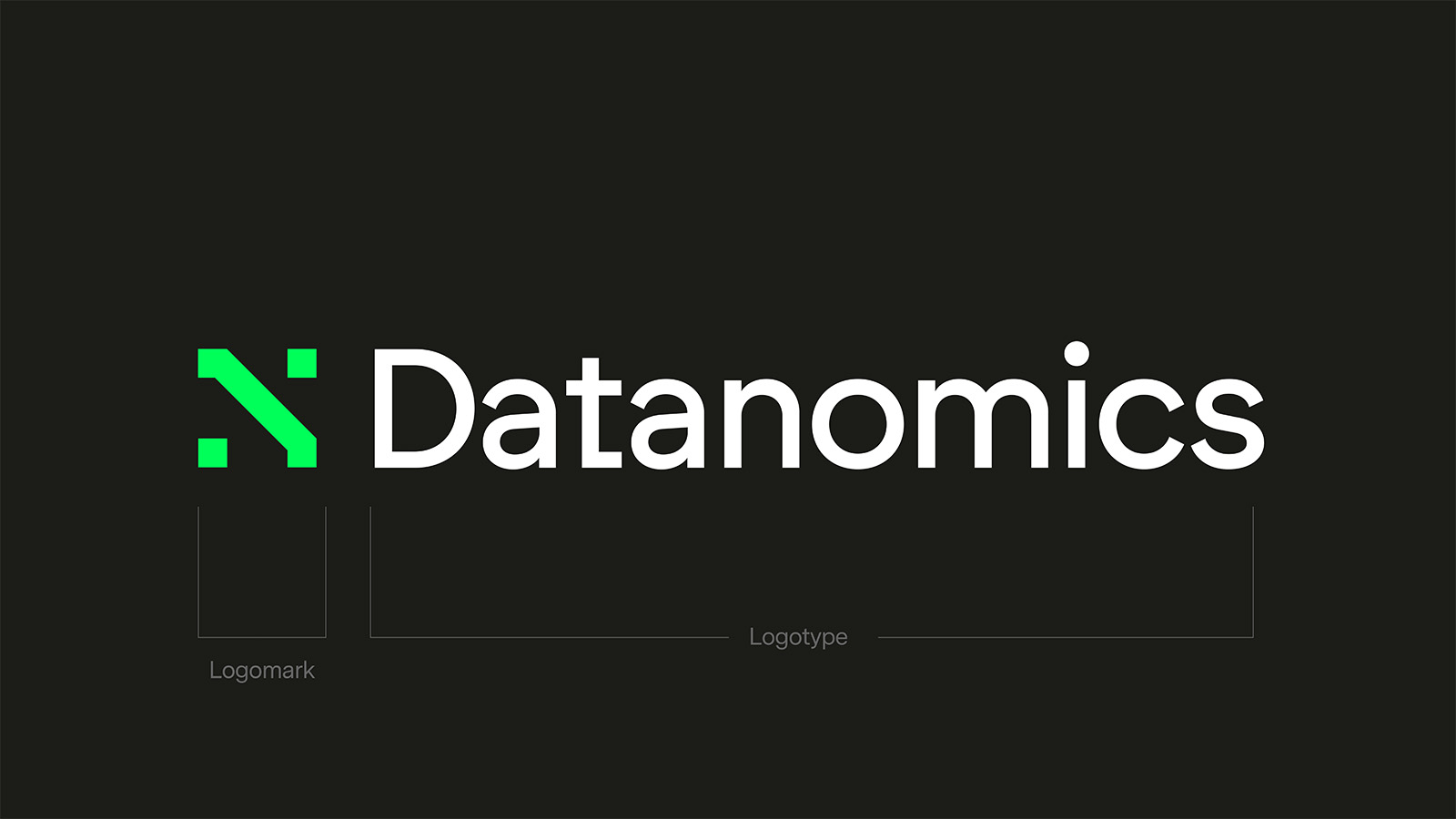
As the second month rolls round, so too does our second brand identity commission, with data segmentation masters, Datanomics. Put simply, they take huge sets of customer data, mangle them through their analysis machine and spit out insights that help create neat segments that brands can market to effectively.
Founder, Andrew, originally sounded us out to help put together a pitch deck, but we felt the visual identity and positioning wasn’t quite matching the vision. We put three initial directions on the table then honed in on one, taking cues from elements across each. Mirroring how the brand works, our creative process zeroed in on the chosen direction, iteration by iteration, to reveal the gold (or the green in this instance).
The final identity mashed up a bold mix of neon green, pixel-art inspired patterns and an unapologetic focus on finding the right individual. One of the major issues in the industry is around a fear of reading data. In most cases, people woring data don't care how the data works. What they care about what insights they can gather from it to result in better outcomes for thier business. 'Better decision making' summarised this sentiment perfectly.


Grace & Favour
Continuing on the trend of turning people away before they are ready, we were introduced to Paul from Grace & Favour - an absolute master at turning spaces from idea to reality. Grace & Favour’s product and service are absolutely mind-blowing — if you need your home or retail store renovating and restyled, Paul really is your man — and we bought into his passion immediately. Grace & Favour approached us to design a table-top photo book that demonstrated the beautiful spaces they had transformed over recent years. But during our discussions, it became clear that they simply didn’t have the quality of photography that would do the company justice. Reluctantly, we had to turn them away, but not without some advice and guidance. We directed Paul to photographers that we knew he could trust and consulted on what his brand identity said to us. Thankfully, he understood and appreciated our honesty.
Sometimes, you just have to keep things simple: Don’t be a dick. Don’t take money just because you can. Be considerate and helpful and people will appreciate that. We’d be hearing from Grace & Favour again later in the year.
Crown Northampton
For a number of years, we’d been building a relationship with luxury footwear makers, Crown Northampton. Like the name suggests, Crown are ridiculously passionate about the local area and the skill that resides within it. Hell-bent on working with like-minded individuals from the NN postcode, we embrionically began to work on some creative campaigns together. In Feb, we worked on some simple reels for socials, which would become the catalyst for a tighter partnership as the year progressed.
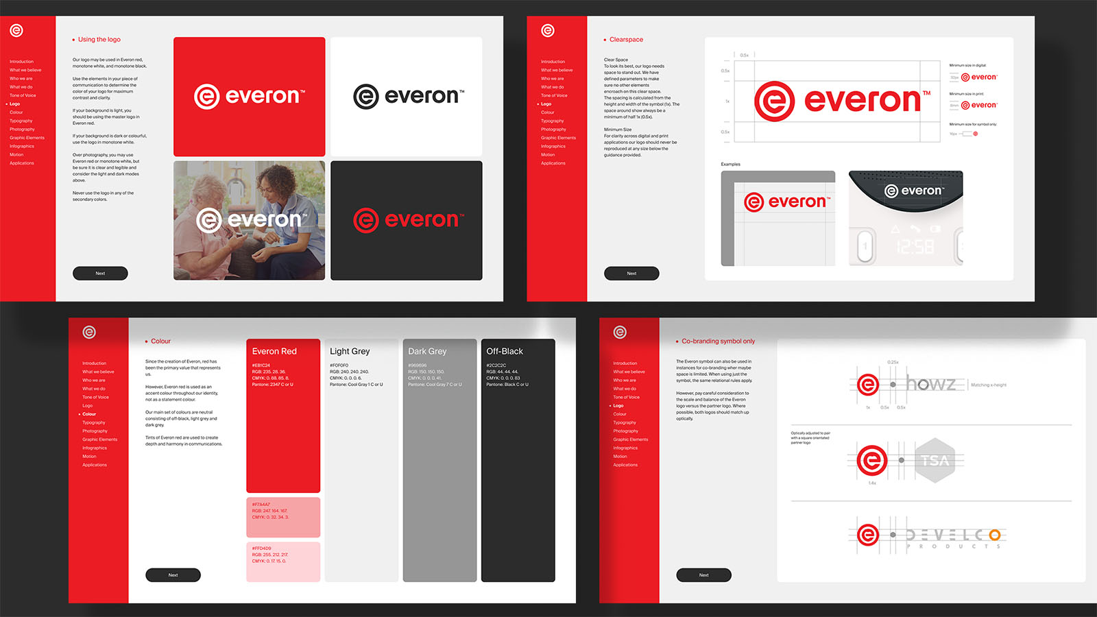
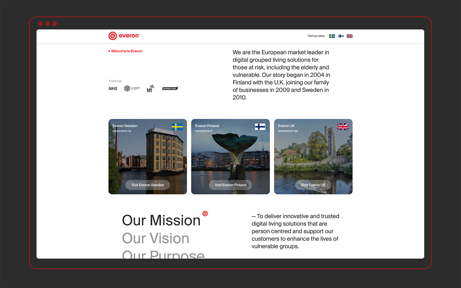
Everon
Another project that kicked into gear was expanding the identity for Everon, the innovators in intelligent assisted living. During 2023, the master brand was rubber-stamped, but had laid dormant since sign-off. Exhibition season was creeping up so we had to create some visual assets to support them at various events, conferences, and meet-ups. That meant exhibition stands, 3D product renders (in collab with Lord Design) and the biggest deliverable — their corporate global website.
That gave Paul (our digital lead) the task of devising a full design system for three regional websites and integrating them into a multi-site CMS. No mean feat. And, with the added pressure of ensuring it was live and operable for a key conference the next month. Sometimes, we do work miracles.


March
On the Move
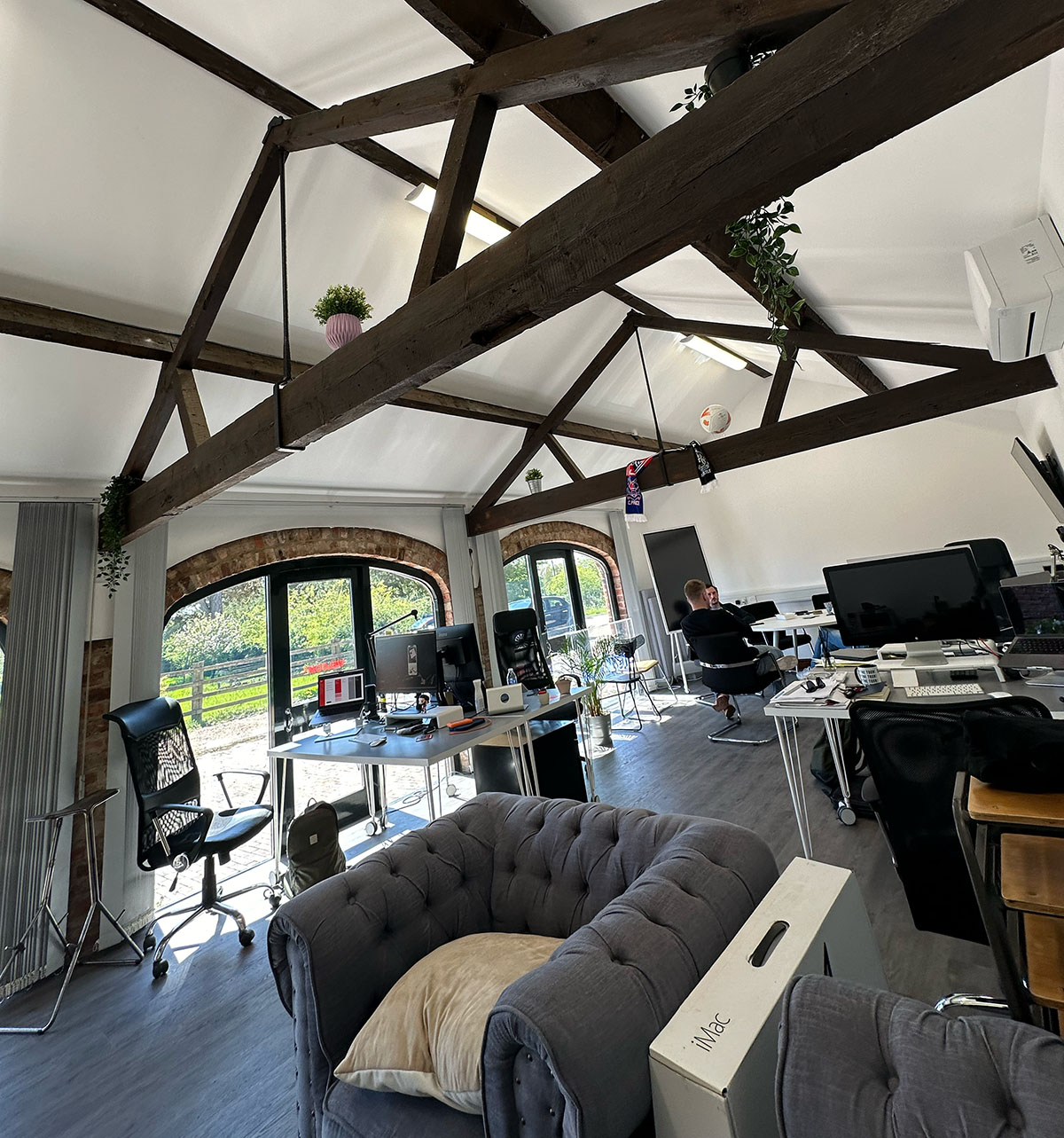
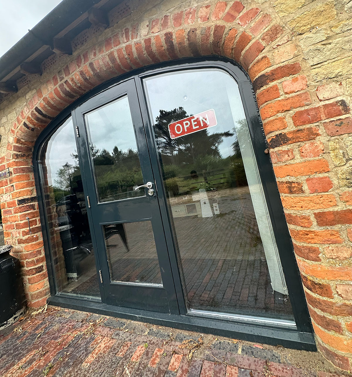
Home number 6
March saw us move to our new digs! Office number 6 for anyone who’s counting. We made the monumental 50m journey from the Stone Barn to the Arch Barn (AKA the Wagwan). We sacrificed a dedicated meeting room space for an open plan, standalone area, so we could make as much noise as we wanted. Notable features included our own forecourt parking spaces and an Anne Frank cupboard. Simple pleasures. BBQs are on in the summer so if you want to head down, you know where we are.
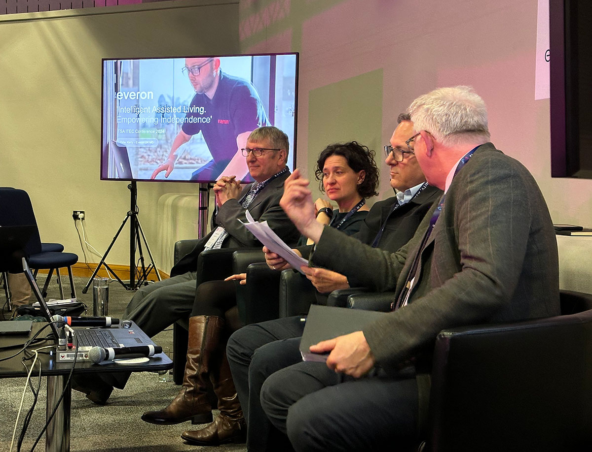
Everon Conference
The hard work of the previous months came to a head, culminating in a soft launch of Everon’s new brand identity positioning at the ITEC Conference in Birmingham. Naturally, Nephew attended to support and assess the market response. There’s a serious lack of solid KPIs that one can use to assess the success of a rebrand. First-person response and sentiment are invaluable to judge whether the transformation is going to be well received, or not.
We had a few touchpoints to assess that we had delivered for the launch: exhibition stand, marketing materials, company keynote delivered by the CEO. Mr Reliable, Paul, delivered once again, ensuring their global website was live and publically viewable as well.
Sentiment amongst attendees was extremely positive - always a good start - leaving more development to be done throughout the coming months.
FluCamp
For over half of our 10 years in business, Nephew has acted as a creative partner for clinical trial facilitators, FluCamp, providing creative services across virtually their whole brand ecosystem. In March, we overhauled their volunteer application pages on flucamp.com to improve the user experience and connect it with the Salesforce CRM. This meant working with lots of data and manipulating Gravity Forms to build personalised forms with conditional logic and custom end-points integrated with email. The front-end was treated to a refresh too, demonstrating how we can mix design with code and strategic logic. It was a tricky project with lots of testing, QA and documentation but was a testament to close collaboration.

AllChild
Also in March, we began working with children’s charity, AllChild, to develop their brand materials following a recent name change and identity update. Previously called West London Zone, the project and relationship was a bit of rollercoaster.
Similar to most other projects, we were invited to meet to discuss their requirements thanks to a recommendation from a mutual trusted contact. The day before our meeting, on a balmy August Friday in 2023, we were informed that the meeting would now be a pitch rather than an informal discussion. Neil and I scrambled together a document that loosely touched on how we would approach the rebrand, showcasing some previous projects that were either relevant to their industry or that faced similar challenges. Needless to say, we didn’t win the pitch.
Fast-forward six months to the big reveal of the new brand name and identity. To our surprise, it looked eerily like a combination of two projects we showcased during our pitch (Who did it better?). But we’re not cynical people and agreed to help develop the brand application following submission of brand guidelines.

Venn Life Sciences
March also saw us create the first set of ad graphics to promote Venn Life Sciences series of webinars and online events. Merging a combination of lab-based imagery, on-brand blues, greens and yellows, and key messaging. The graphics would be spread across digital platforms such as LinkedIn, X, and their own website, with the objective of driving subscribers and attendee sign-ups.

April
Everon, and on, and on…
E.Woodford Content
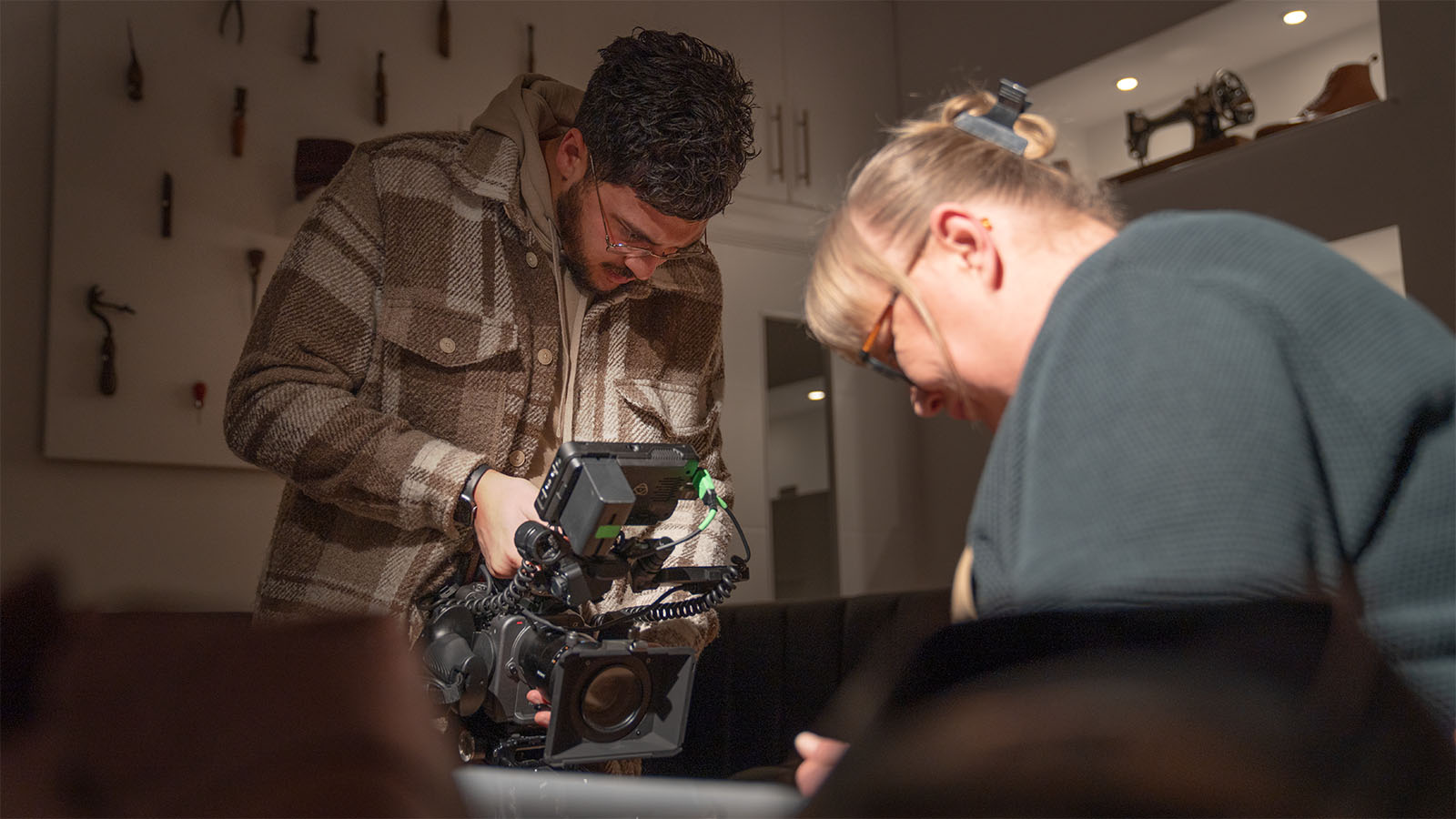
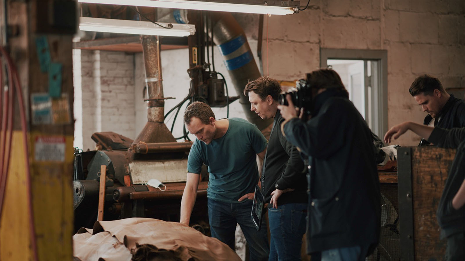
While the new website was being designed we worked on new content to add fat to brand. April was E.Woodford filming month! We spent time travelling with our production partner, Don Weerasirie from Limelight, interviewing suppliers, partners, and collaborators to peel back the curtain on all the things that go into making E.Woodford the best footwear money can buy. Our travels took us to Yorkshire to visit the C.F. Stead tannery; J&FJ Baker in Devon; and Springline just round the corner in Northampton. Combined with our previous filming at the Horween Tannery in Chicago, the intent was to create a series of films that could be used online to demonstrate the E.Woodford brand.
Venn Life Sciences
The second set of ad graphics were created for VLS. Although the next webinar was focused on a different subject matter, the design parameters remained the same as per our first iteration in March. Using a combination of different fluid shapes and dynamics, we created a set that was distinctive but familiar.

Everon
Following the soft launch in March, we rolled out a standalone landing page for Everon Global - the first step in the ‘One Everon’ strategy for the business. Simulatenously, Paul developed the regional office websites under a WordPress multi-site environment. This included translations for the Swedish and Finnish markets and geo-specific content based on their individual market needs.
Chris and I fleshed out the complete brand guidelines for the global brand. Logo usage, colour use, typography, art direction, data visualisation, the whole shebang. Inspired by Nordic design values of minimalism, simplicity and reductionism with Everon’s signature red as the hero of the piece.
May
Hard to Beat
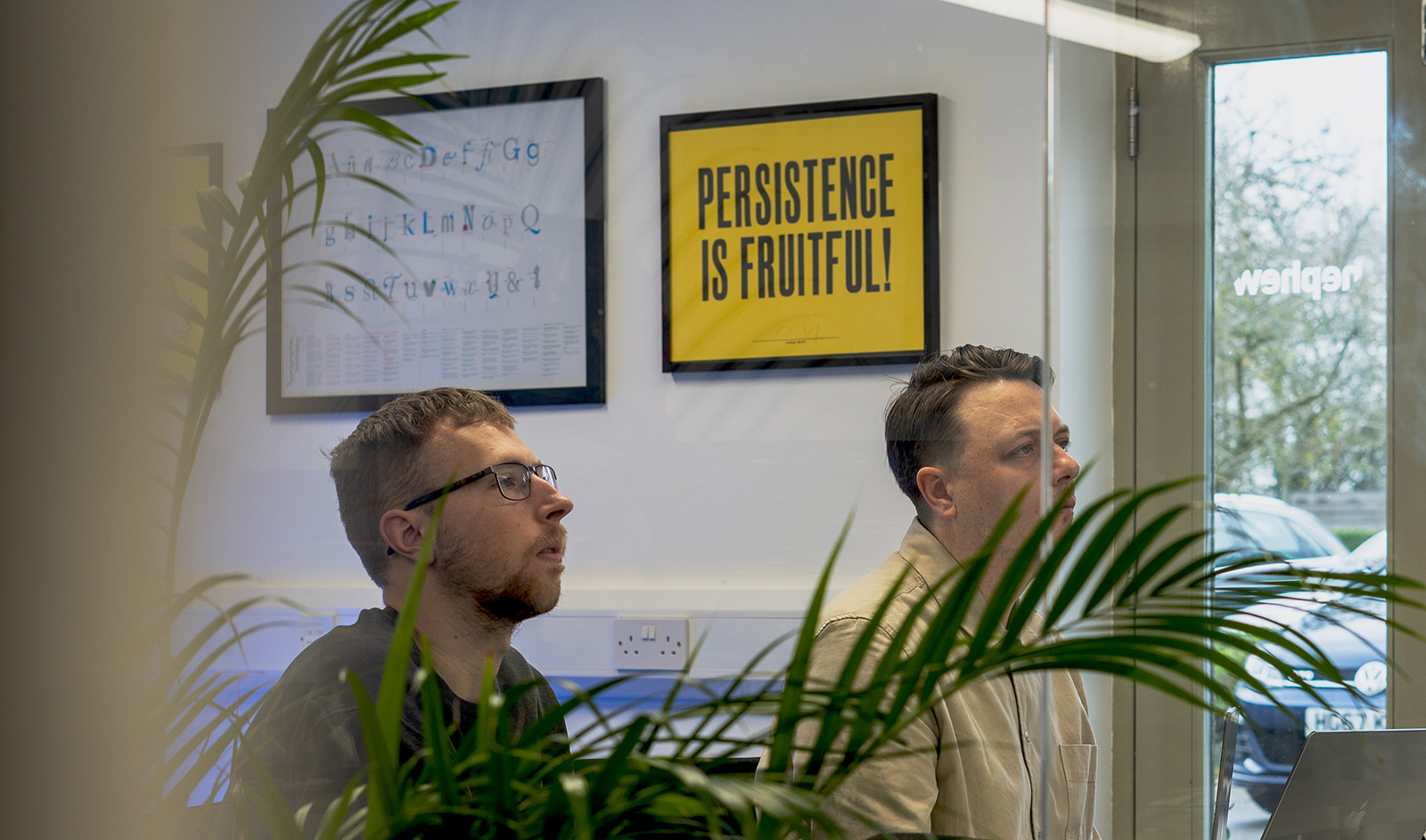
AllChild
We have a poster up on the walls of the office that says: “Persistance Is Fruitful”. Although we were overlooked for the rebrand, we now found ourselves in the position where we’d built trust with the team at AllChild to the point where we were asked to build their corporate site. Designed by the studio that developed the new brand identity, our task was to build what was submitted and fill in the gaps that were missing. Paul fired up Webflow and built the whole thing from top to bottom in just a short three weeks, hitting the deadline to have it live in time for their brand launch. This included integration with Zapier to route online enquiries to various mailboxes.

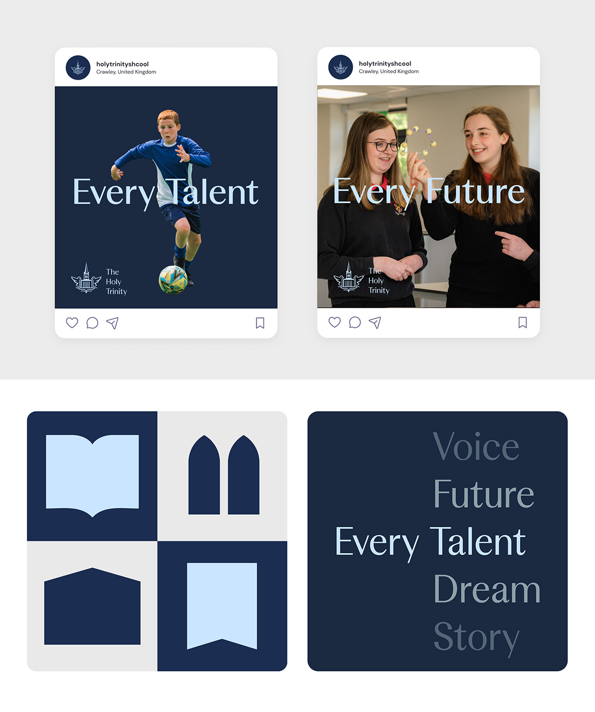
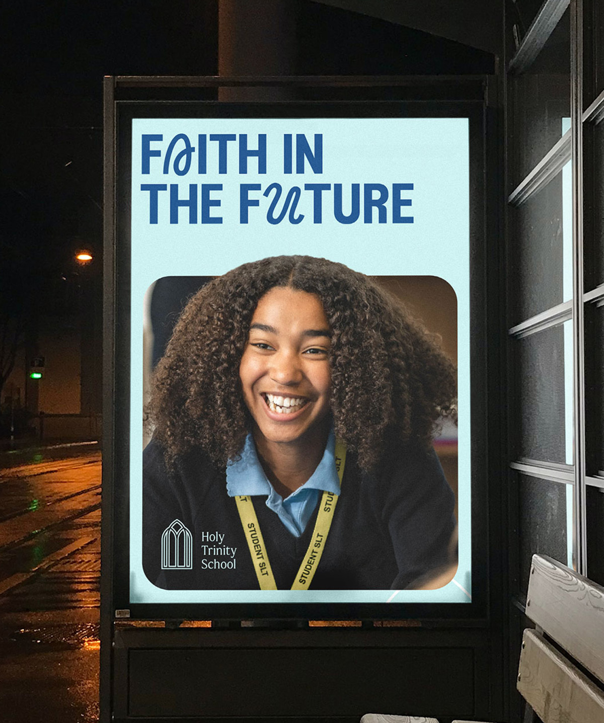
Holy Trinity School
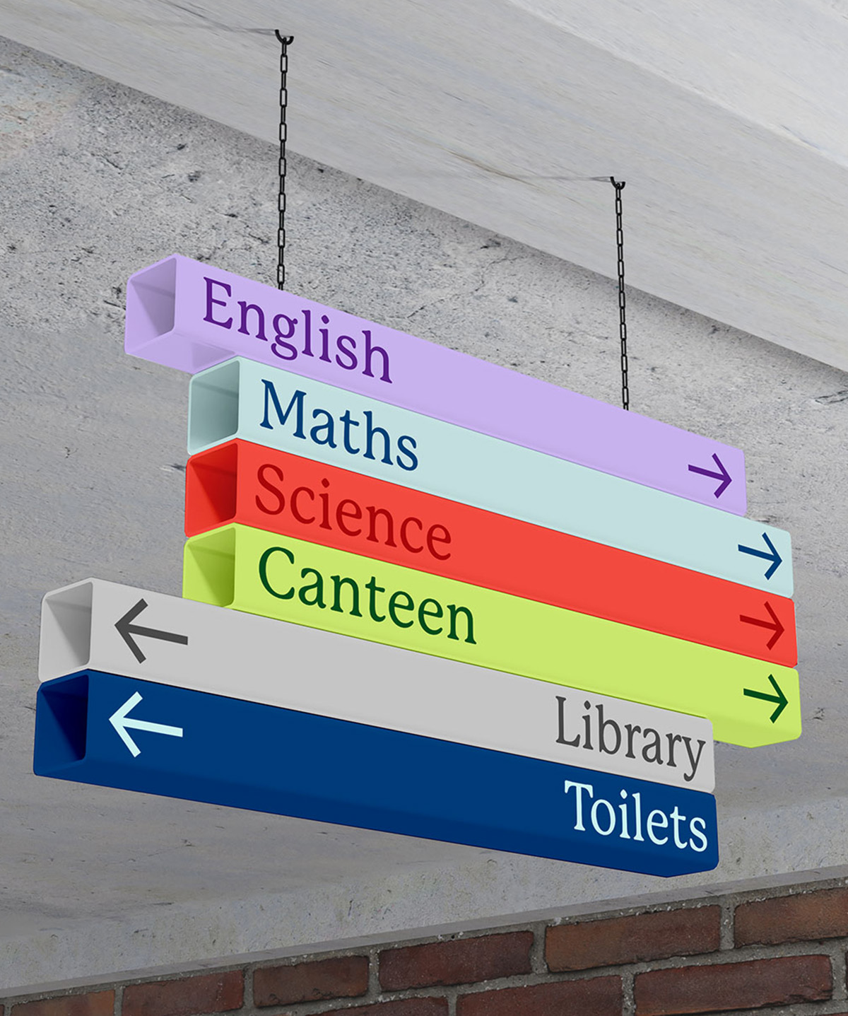
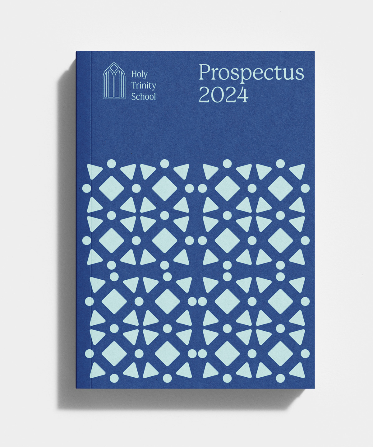
In May, Neil and I made the trip to Crawley to meet the Headteacher and the leadership team at Holy Trinity School - a Church of England secondary school open to all faiths. With bold future plans for the school and the wider community, HTS were confident that the time was right to change its image.
The team’s passion and unwavering commitment to development of young people was truly inspiring. With a clear desire to focus on modern technologies and be seen as a 21st century school, we felt we could add some real value to help them transform their identity. More on this later...
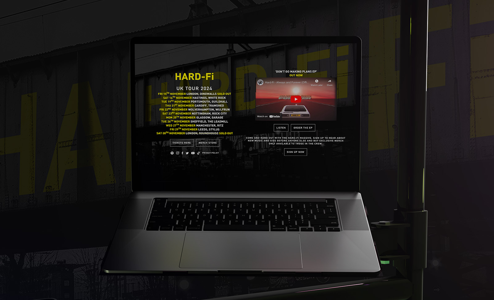
Hard-Fi
We’ve had a long-standing relationship with Rich Archer, the lead singer of indie band Hard-Fi. Recent years has seen a resurgence in their popularity thanks to the latest generation discovering their music through streaming platforms. In response, Hard-Fi announced a live tour that Nephew developed the promotional landing page for.
June
Timing is Everything
Staff Changes
One thing you can always guarantee in business is that people will always come and go. Despite this, we’ve only ever seen four members of staff move on in our 10 year existence. But each and every one has left us to become a better version of themselves. It’s a delight. We’ve always tried to foster an environment of family — where work friends become like brothers, sisters, cousins, or, dare we say it, nephews.
In June, we said goodbye to Chris who left to take up his dream role as designer at his beloved Northampton Saints, a position he just couldn’t refuse. It’s not every day you get the opportunity to become a pivotal part of your favourite sports team.
Chris’ departure brought to an end his two year stint at Nephew after joining straight from uni back in 2022 and meant we needed to recruit for a new designer.
In a curious twist of fate, and before we could even advertise the position, we received an enticing email from an exciting new prospect. Like I always say… timing is everything.
That prospect was Ollie Parker, a design graduate from Falmouth University. Ollie’s portfolio blew us away and after a jovial face-to-face meet (“What’s your stance on music, Ollie?”, “Well, I listen to it if that’s what you’re asking!”) we offered Ollie the role to which he duly accepted. Ollie had previously interned at Wolf Ollins and most recently worked as a designer at Studio Ignite.
E.Woodford
Dominating the first six months of the year, we finally had the pleasure of launching the E.Woodford website and offering the finest hand-welted footwear to the world. Eventually, we will get round to documenting all our work in a big project review, most probably as a short film.
We don’t normally deliberate for so long, but as E.Woodford is such a unique offering, our aim was to ‘get it right’ instead of rushing it out the door. Chris, Lucy and the guys at Crown Northampton (the sister brand to E.Woodford) need to be credited for their saintly patience over the course of the last 12 months. It had been a long road, but finally it was out there for people to interact with and purchase. Huge credit has to go to our web developer, Paul Bergin, who did a masterful job in getting everything set up and working. As an unconventional site with complex ecommerce features, it really was a headspinner at times. Visit www.ewoodford.com to view the goods.

Sporting spectaculars
June also brought with it the customary summer games that captured the attention of the public. We had Euro 2024 which started out agonisingly (for England fans) but nearly ended in glory. Will I ever see England lift a trophy in my lifetime? Who knows?
This was followed up by the Olympics in Paris which was an absolute carnival of delight. You can’t beat the opportunity, every 4 years, to jump around hysterically watching the final of the Equestrian showjumping, or who will forget Alex Yee winning the Triathlon on the final bend?
The Olympics always raises interest and debate over branding. For the first time, the official Olympics brandmark was represented by human form — a perpetual fire that formed the face of a female, representing France. Then there were the gloriously complex and crazy sporting icons used to represent each event at the games. Mad genius.
July
Crowning glory
Holy Trinity School
The first summer month saw us submit our initial concept proposals for the Holy Trinity School rebrand. Our standard process took place: Three very different directions, each containing strategic positioning rationale and each with a distinctive ‘big idea’ theme running through them.
As we write, we’re still working with HTS to decide on the final direction, but here is a collection of ideas that we put on the table during July.
The general feedback was extremely warm and fit with the school’s future direction. Initially, the review team were unanimous in their chosen direction, but the proposals hit a few snags once it went to board level. The overall identity was approved, however the brandmark is still under review. Watch this space.
New facility for hVIVO
Another milestone for our long-standing client, hVIVO, as they moved into a built-for-purpose facility in Canary Wharf. This included offices and a new lab facility to carry out clinical trials in the heart of London. A huge step for hVIVO and represents another giant leap forward after a sustained period of sustantial growth.
Nephew attended the opening event, alongside videographer partners, Limelight TV; carrying out filming of keynote speeches and a tour of the facility which would eventually be clipped up for social media and across digital channels.

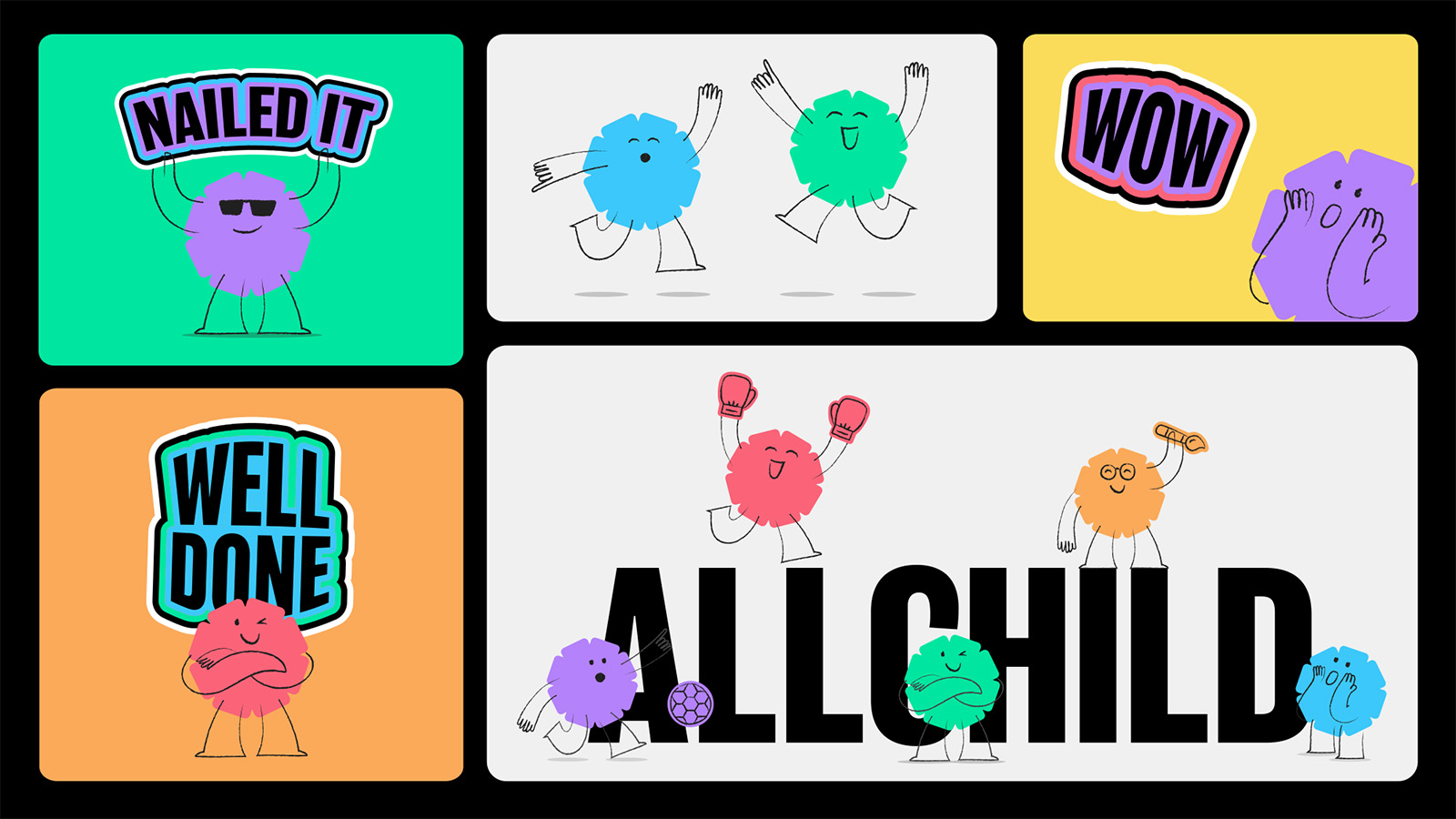
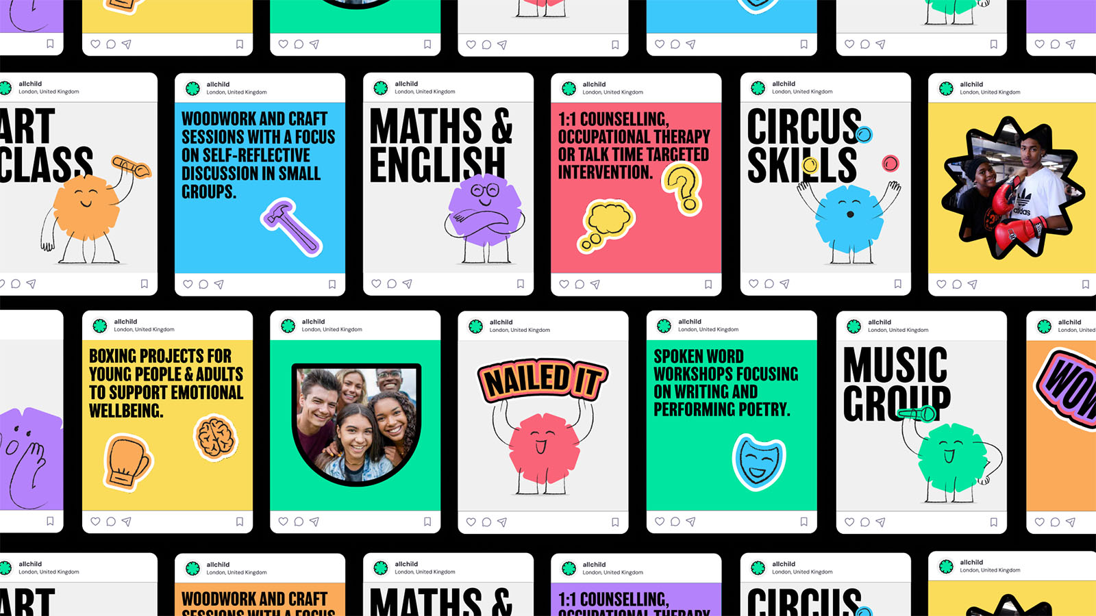
AllChild
Our long-game outlook with AllChild finally paid-off as we were commissioned to carry out an extension of their recently introduced brand identity. What was missing from the first iteration (that Nephew were overlooked for) was the more emotive, child-friendly side of the brand. The corporate face of the business had been captured, but was missing the personality that resonated with a younger audience.
We had loads of fun creating a suite of new mascots to represent AllChild, alongside sticker elements that could be layered on top of the corporate identity to inject an irreverent side into the brand.

Crown Northampton
Following the launch of E.Woodford, we entered into a retained relationship with sister brand, Crown Northampton, with the intent of elevating their outbound marketing creative. Product launches, website management, paid and organic ad campaigns and general creative support came under our wing.
The first campaign we created was for the launch of a unique collection of sneakers, made from the same very leather used to make NFL footballs and NBA basketballs - the first time this had ever been done in footwear.
For the campaign, we paid homage to the fans and players of both sports. Using assets from a recent photoshoot in combination with public archive footage. The footwear was released as limited edition, so exclusivity was key. The stock ran out in less than a week. This was to be the first of a range of campaigns we helped Crown launch over the course of the remainder of the year.
August
10 years in…
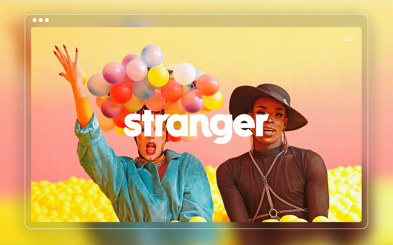
Stranger Group
Recommended via our friends at Ditto, we collabed with creative communications agency Stranger to design their enquiries site. A short, but sweet collab built in Webflow with CMS integration to update latest projects.
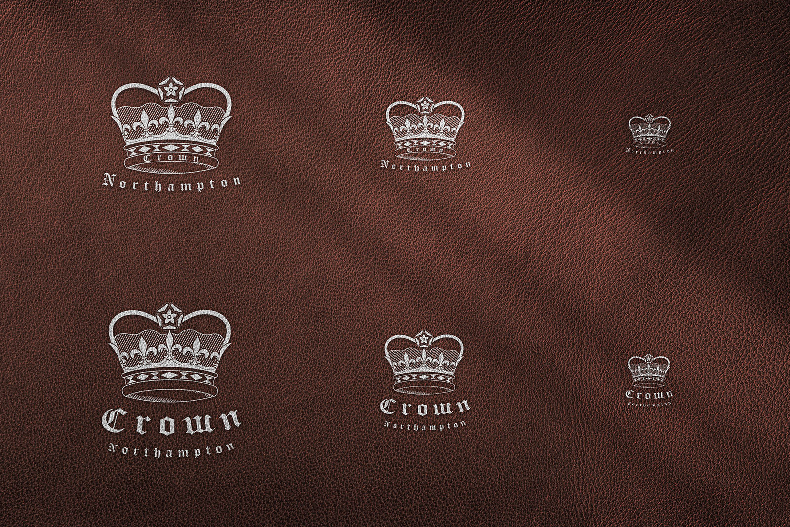
Crown Northampton logo refinement
As simple as it sounds, the subtlest of changes can often make the biggest of impacts. It’s not always the big concepts that we like to get stuck into; we obsess over the technical details too.
Having worked with Crown for the last few months, there was one itch that we needed to scratch: the Crown logo just wasn’t working at small sizes - an absolute schoolboy error in this day and age. On that note, we sweated the small stuff to update the master logo so that it could be identified at a distance as well as on the smallest of swing tags and on social profiles.
End of an Era
In August, our seven year relationship with FluCamp came to an end after opting not to renew their support & maintenance retainer with us. An absolute rollercoaster through the years, Nephew had outlived six marketing managers, developed three iterations of their volunteer recruitment site and created countless ads, graphics, merch, videos, motions pieces, brand strategy, the lot. Not to mention hosting and management of the recruitment site including configuration of firewalls, security monitoring, data protection and integration with various CRMs.
It’s always disappointing to end a long relationship, but was absolutely the right time for both parties to move into a new era. We wish the FluCamp team huge success for the future, and Nephew continue to partner with sister companies, hVIVO and Venn Life Sciences.
Happy Birthday Nephew!
August 18th 2024 - Nephew turns 10 years old. As mentioned at the outset - a substantial milestone for the studio and the people inside of it.
Anyone that has run a business knows how hard it is. To do so, succesfully, for 10 years is no mean feat. It’s not always plain sailing. The COVID era was one that tested many to the limits; Nephew being no exception. But we’re still here, still swinging a good punch, and still sticking to our promise of transforming brands.
The challenge for most businesses is dealing with growth without compromising financial health. Thankfully, we’ve always been committed to staying small and agile. That doesn’t mean we won’t grow bigger than we are, but we have design on becoming a behemoth. There is something nice, for the clients, about being able to speak to the person doing the work and removing the barrier of defined structure which can often mean a chain of command. Design is often about interpretation - taking the prompts from a client and just ‘getting it’. We never and will never want to have a situation where a client has to talk to an account manager who passes a brief onto the designer. For us, that just doesn’t work. Sticking to these principles is vital for us to deliver good work.
Here’s to another fruitful 10 years!
September
Ramble On!
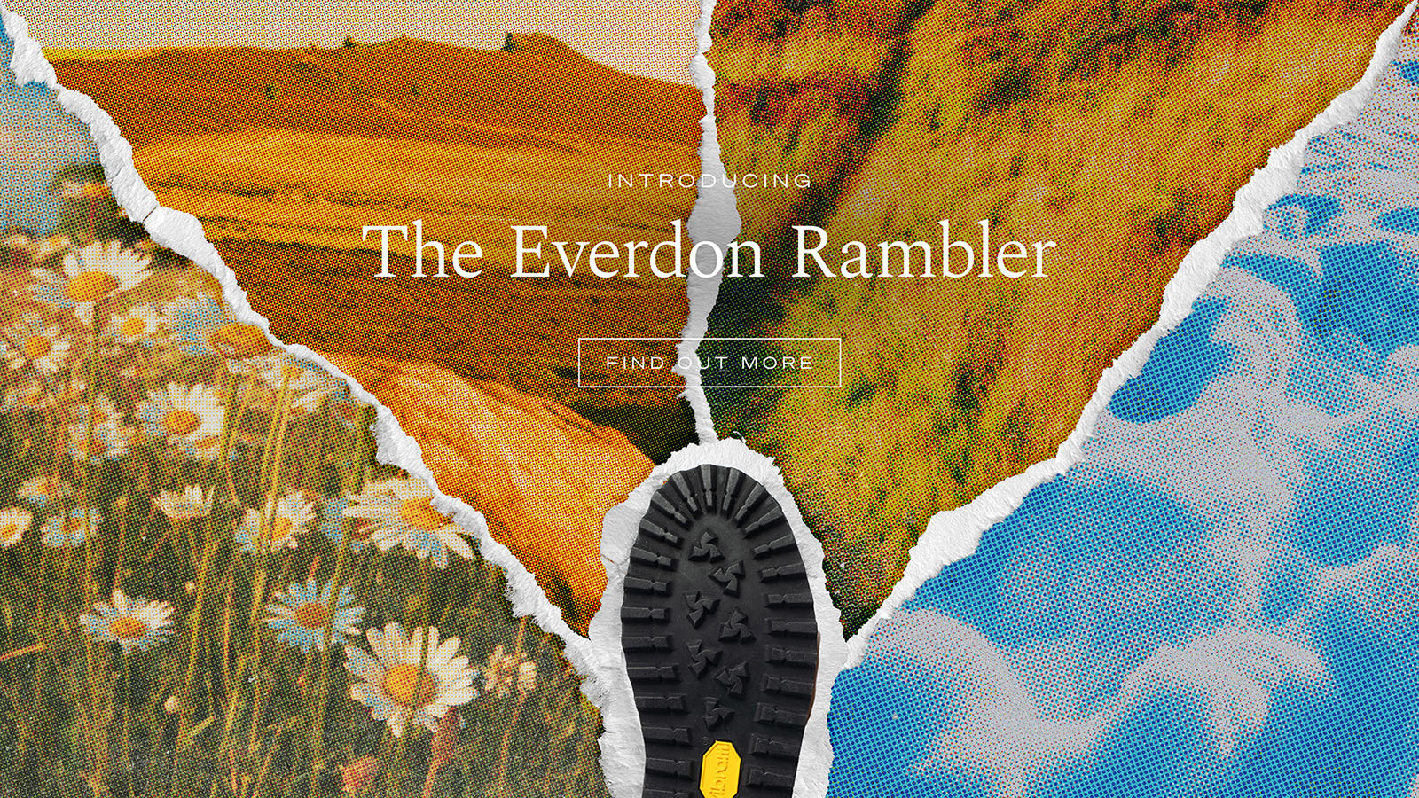
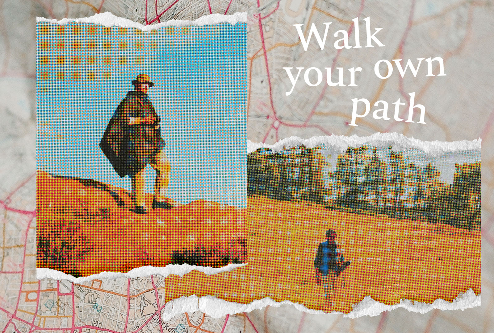
Crown Northampton
Our second product release campaign for Crown Northampton dropped in September. This time, it was focused on a new walking boot called the Everdon Rambler. Our visual campaign drew attention to nostalgic days of camping and the changing seasons - especially aimed at the US market. The footwear can be worn at any time of the year, through rain, snow, or the dusty dry days of summer. We created a collage-style inspired by postcards of yesteryear using halftone effects and on-location imagery and footage. Ramble on!
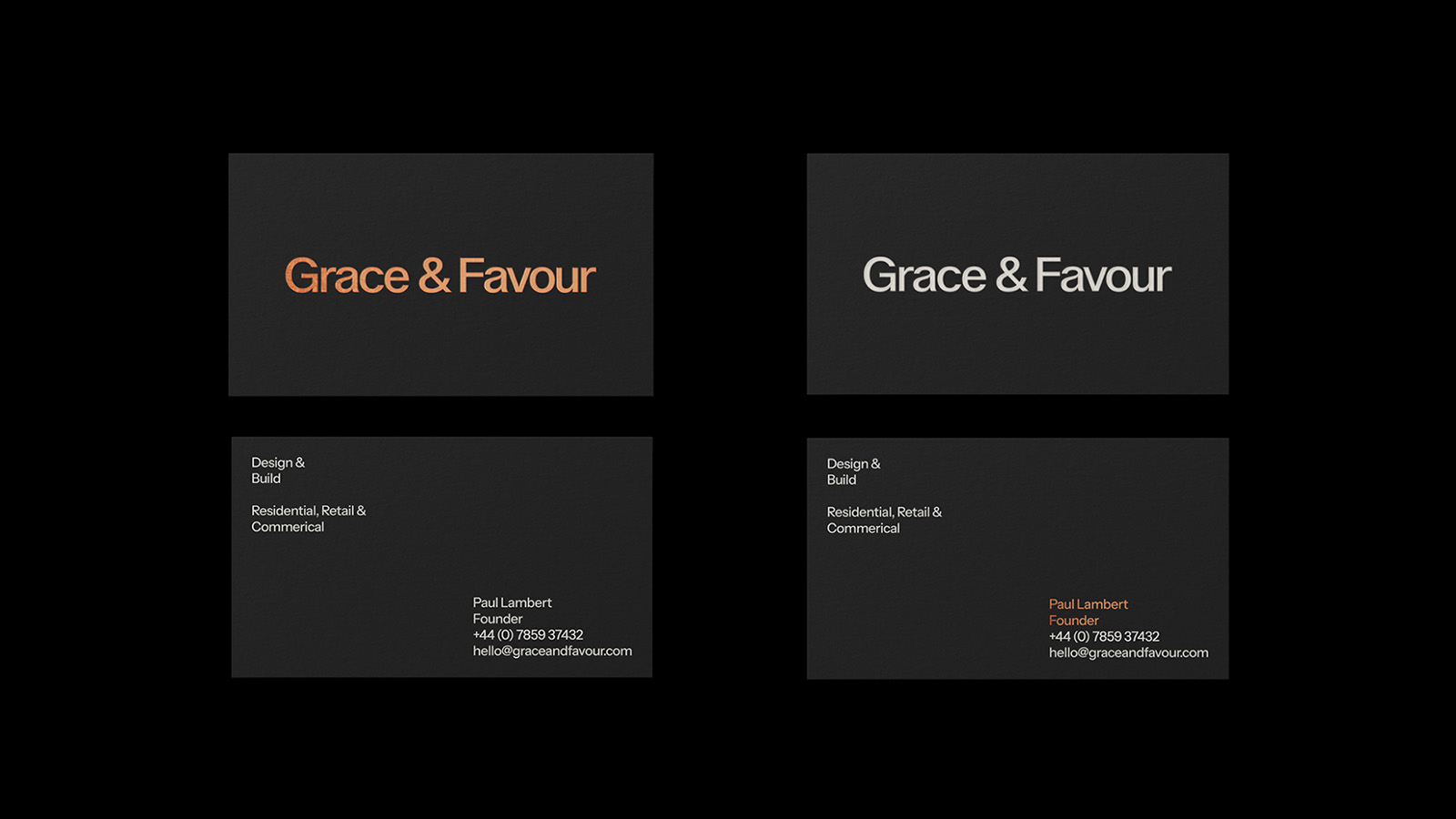
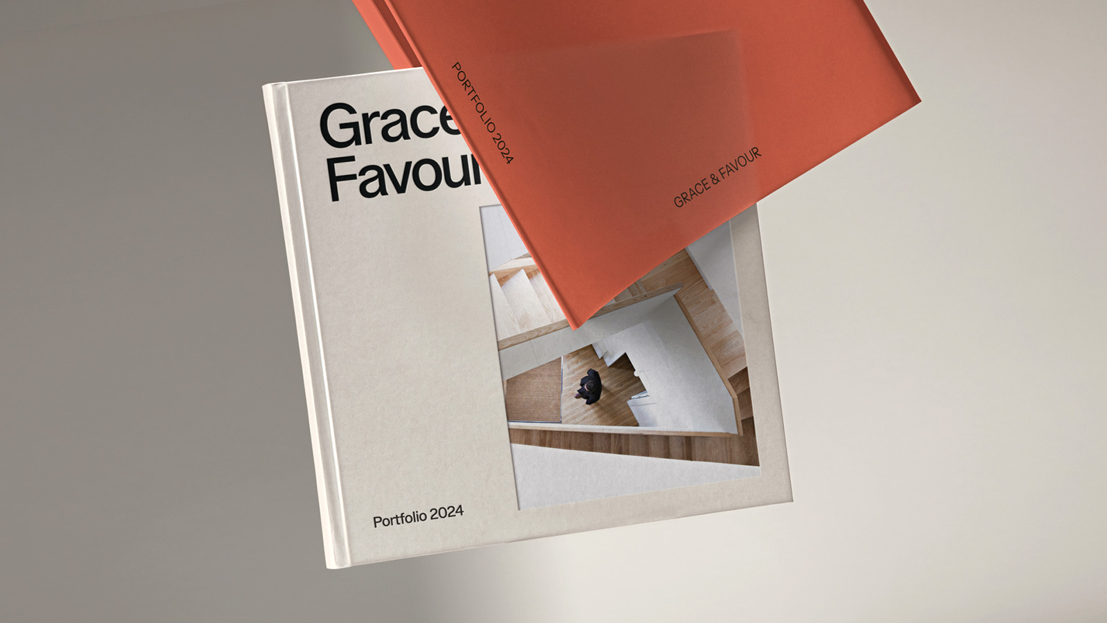
Grace & Favour
Remember, back in February, we met with interior transformation specialists, Grace & Favour? We originally declined their request to create a table book due to insufficient imagery. Six months of regrouping and we’d got to the point where the brand identity was under the spotlight. Owner, Paul, wanted to change direction and inspire people through good, honest design with a nod to high-fashion.
Ollie played a blinder here, keeping everything simple and refined. Hard to do when tempted to go wild. A shrewd choice of typography, colour and layout was the right play to augment what was an already strong proposition from Grace & Favour. The master logo received a glow-up and was partnered by a simple G&F monogram for use in short form situations.
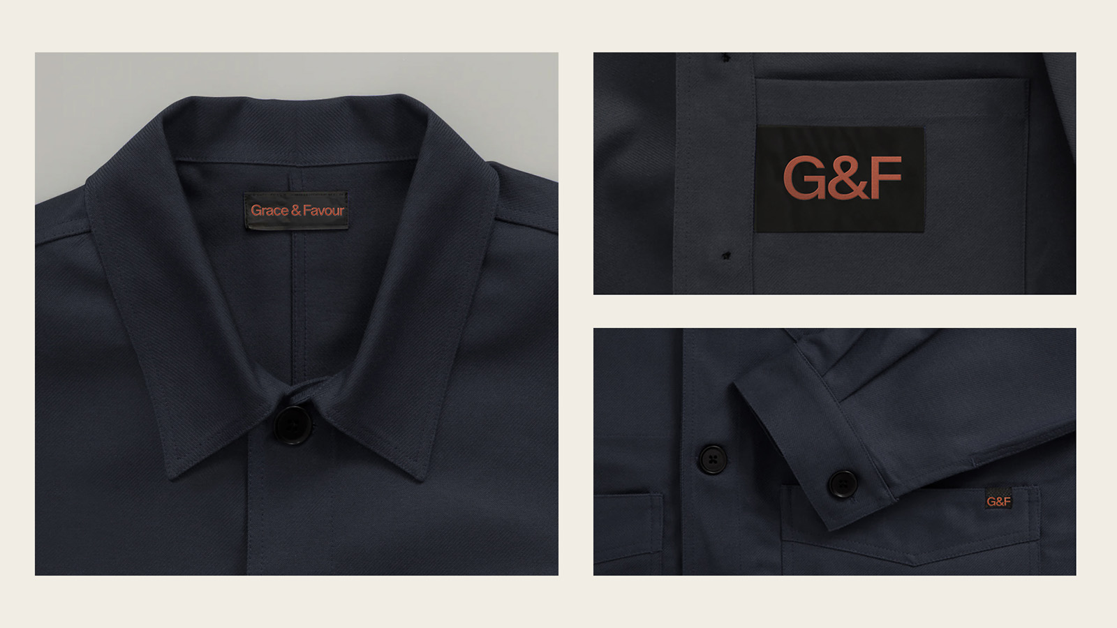
We also developed a range of workwear ‘merch’ that would act as fashion statements when the on-site work really began further reinforcing G&F’s commitment to beautiful design.
hLAB
Our big site build of the month was for a new service delivered by hVIVO, called hLAB. A virtual clone of the main hVIVO website, hLAB acted as a standalone microsite to communicate their specific lab services.
October
New York, Baby
Stitchdown NYC
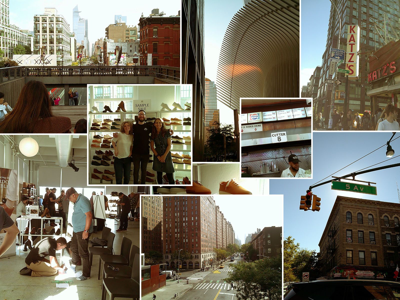
The autumn months started off with Nephew attending Stitchdown Bootcamp in New York, for the second time, to support the Crown Northampton and E.Woodford brands in their efforts stateside.
It is such a valuable experience to get up-front with consumers to talk about their experiences, understand why they are so passionate about the brands they buy and assess what their expectations are for the future. The insights are invaluable for a team hell-bent on delivering the best product they can.
As part of the event, we created stand displays, merchandise and upgraded the Crown Sample Sale website so that attendees at the event could order surplus stock right there and then.
Crown Meta Ads
While preparing for Stitchdown, we were also ramping up our support in paid advertising across the meta network. This meant doing a lot of research and testing to assess the efficacy of ad formats. What works best? Video? Image carousel? Should it be 15 seconds? 30 seconds? And what imagery and copy are viewers going to be most engaged by? In these instances, design is totally dominated by data, so intuition only has so much influence. That said, as brand guardians, our remit is to ensure that all design remains on-brand and authentic.
In addition, we worked to improve the aesthetics of the Crown onboarding mailer ‘welcome’ series. Here, highlighting some of the major features of the brand, the footwear and what it means to own a pair of Crown sneakers. Subscribers would be enrolled into the flow after signing up and receive each informational mailer on a weekly basis.
November
Who’s that knocking at the Daw…
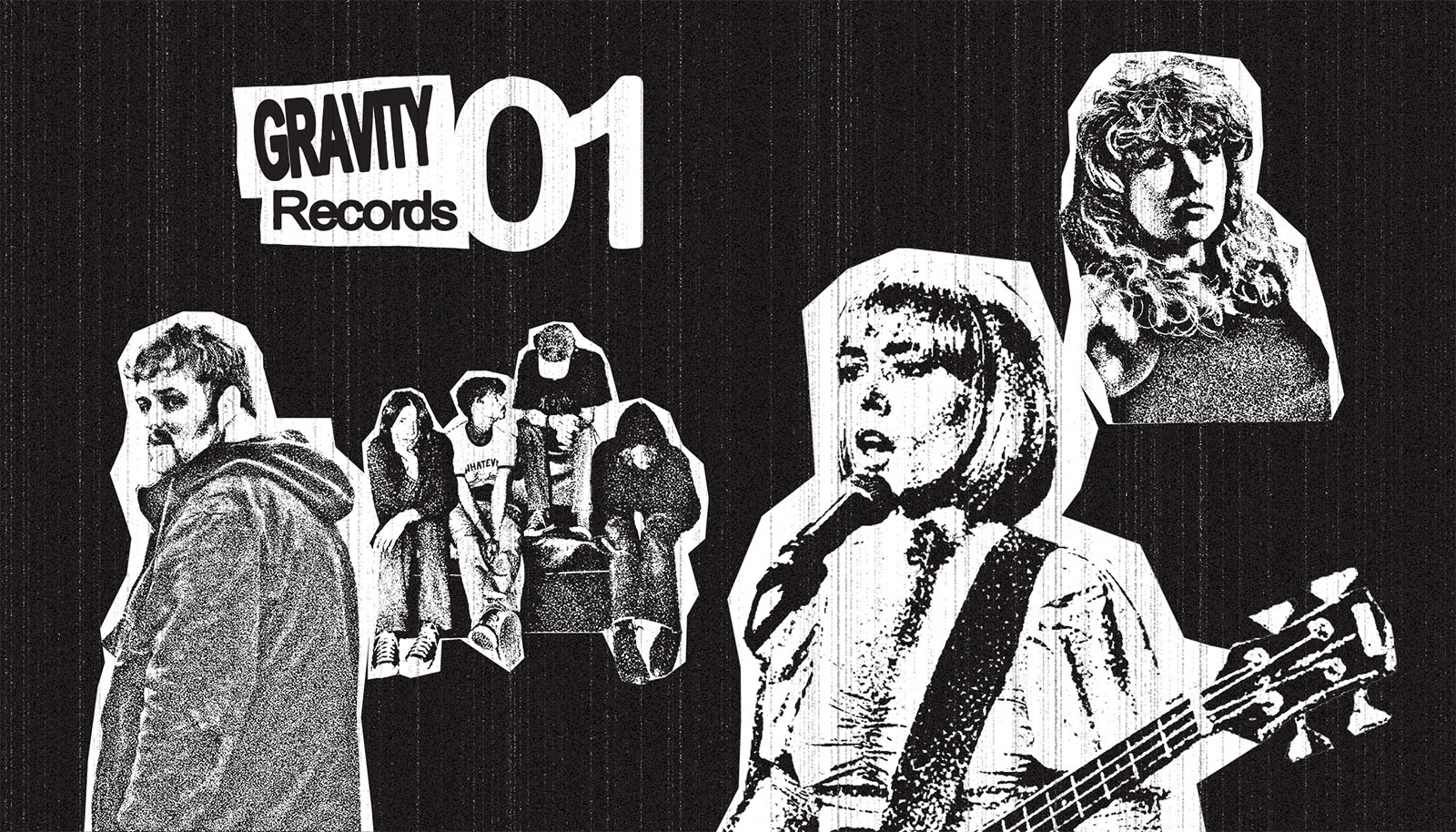
Gravity Inc
Throughout the year, we consistently produced social assets for music management, publishing and records agency, Gravity Inc.
However, we were introduced to a standalone campaign for 2025 Records Store Day. We can’t speak too much about the plans before the big reveal in April 2025 but here’s a sneak peak of some of the concepts we delivered during November.

DawBell
Back in 2019, we collaborated with entertainment PR mega-beasts, DawBell, to design and build their main site. Over the years, it has been a hugely influential property for us, leading to many additional conversations and projects.
After 5 years, the DawBell team got in touch again to pursue a delicate face-lift. Just a few tweaks needed with some new page layouts, updated typography and some additional content. The biggest change was to flip from WordPress to Webflow - a strong sign of DawBell's ongoing commitment to relevance and reputation.
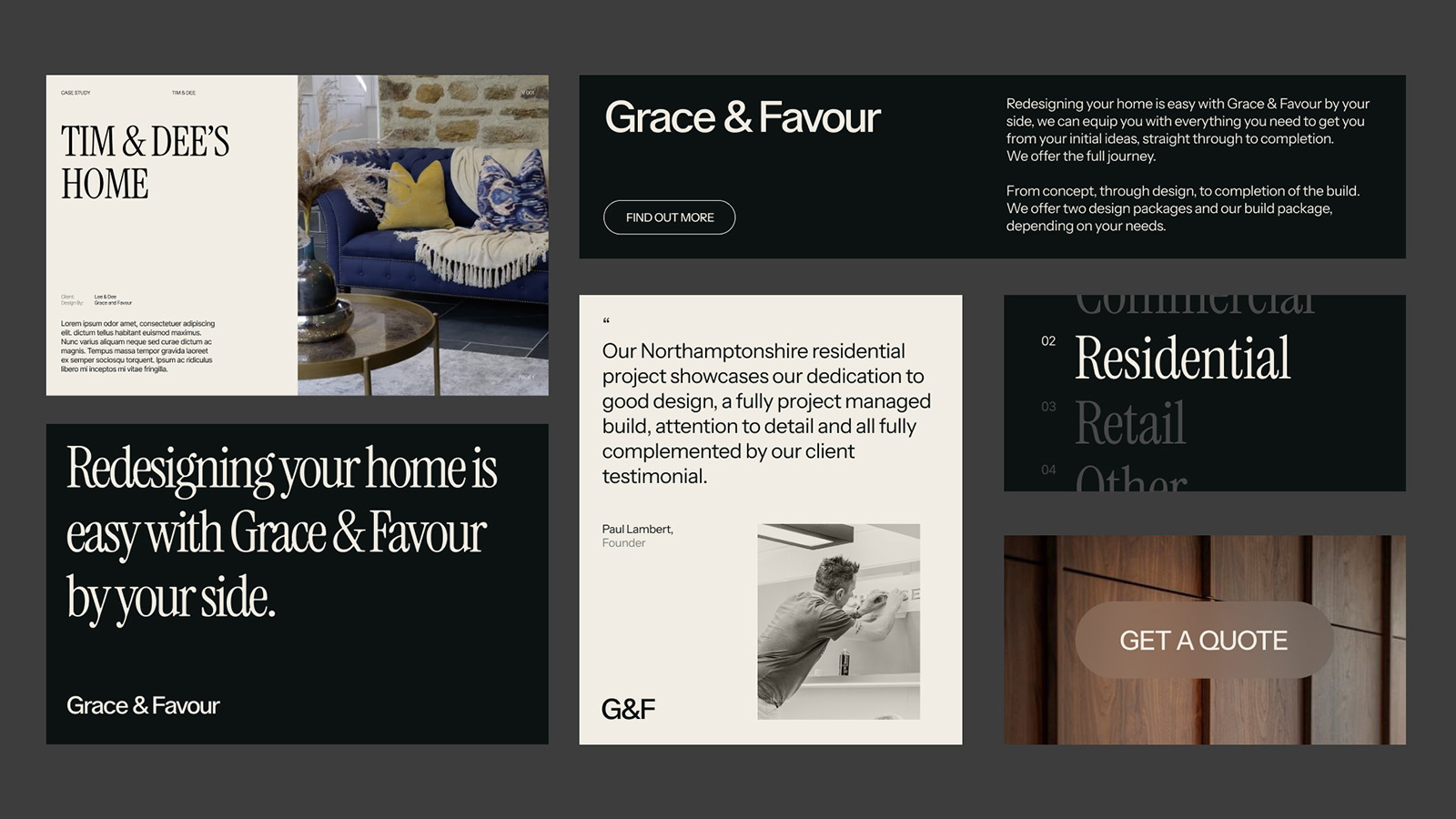
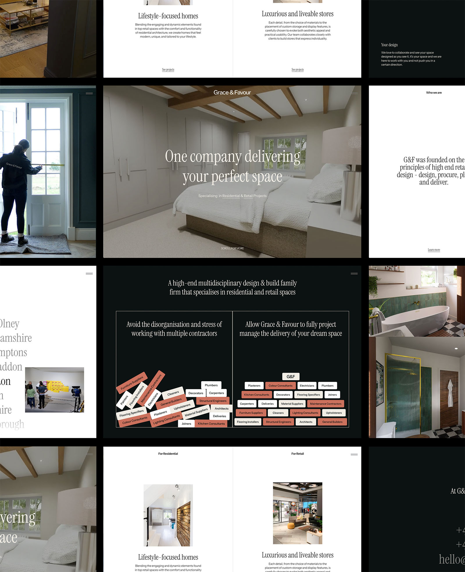
Grace & Favour Website
Expanding on the brand work we started with Grace & Favour back in September, we now turned our attentions to their website. Armed with the new identity system, Paul got to work designing a site that would honour the fashion-inspired direction that Grace & Favour wanted to see. Designed in Figma, built in Webflow, the site consisted of subtle transitions and animations, packed with rich media and minimalist layout that takes prospective customers through the G&F journey.
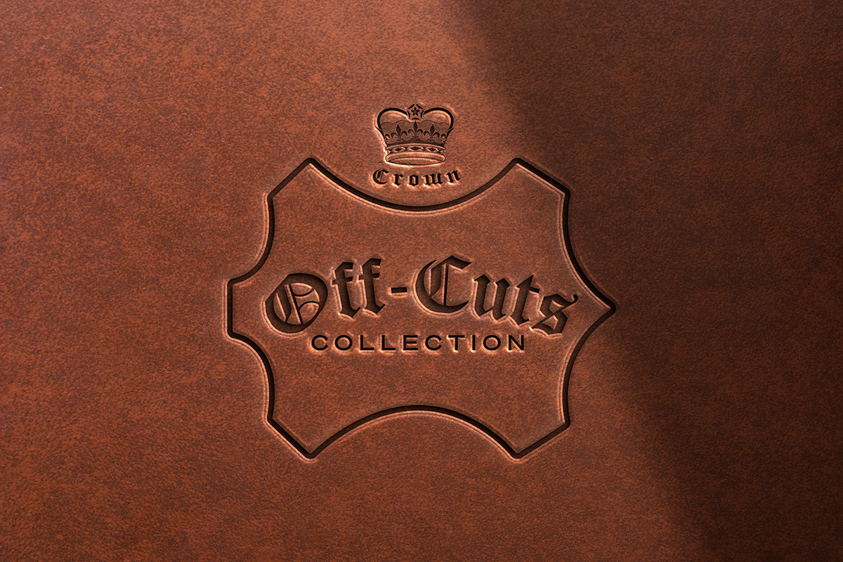
Crown Off-Cuts Campaign
Nephew created the latest campaign for Crown Northampton by introducing the Off-Cuts Collection. Utilising an ethical process that takes the valuable left-over waste leather from shoe making and turns them into beautiful small leather goods, such as wallets, card holders and glass cases.
We developed a mini mark for Off-Cuts — based on the standard leather mark — as well as little social idents to launch the collection. We also developed the Crown Northampton Shopify site, implementing custom logic so that the collection could only be purchased when a pair of footwear has been added to cart. Brand and web transformed.
December
It’s a mystery
Celebrating 10 Years
It’s pretty clear now that in 2024, Nephew celebrated it’s tenth birthday. Have we mentioned that already? But you can’t have a birthday without a celebration.
And in good Nephew fashion, the whole team took the weekend out for a Mystery Away Day. We’re all sports fans, particularly football, so in December we booked a weekend trip to watch a football match somewhere in mainland Europe. The rest of the details were as the title suggests - a mystery. The only knowledge we had was we were flying from Stansted airport. Beyond that, we had no idea where we would be flying to, what teams we would watch, and what would lay before us.
Early Friday morning, we pitched up at Stansted, opened our mystery gift box to reveal we would be visiting…… the historic city of Arnhem, in the Netherlands.
What a weekend it was and what a beautiful country! Our arranged game was scheduled for the Friday evening to watch financially-limited Vitesse who were rock-bottom of the second tier league and without a win in 13 games. But as luck would have it, our presence must have served as the motivation they needed as they ran out 2-1 winners in front of a full crowd.
The following day, we took a train to Amsterdam on beautifully calm winters afternoon. Taken by the laid-back ambience, we walked miles around the city.
On the final day, we secured tickets to the big game of the weekend - FC Utrecht vs PSV Eindhoven. A 40 minute walk from train station to stadium allowed us to take in the architecture and surroundings of Utrecht - again, beautiful to behold.
A wonderful experience and a special way to honour 10 years of Nephew!
BrandAlley
The last big project of 2024 was with a new brand partner - the home of cut-price designer brands, BrandAlley. A proper collab this one, we teamed up with Limelight TV, photographer Jordan Hare and the BrandAlley creative team to create their Christmas gifting campaign.
Combining studio model footage, product stills and graphic design, we produced a suite of assets for organic and paid social media to promote BrandAlley as the destination for Christmas gifting.
Over and Out
So that was 2024. A year we’ll always remember. Loads of projects completed, hundreds of hours of design and development, new relationships forged and new friends made.
Onto 2025, a year that promises to see design return to the top table. You heard it here first.
.svg)


