Intelligent Assisted Living
Scroll

services provided
Brand Strategy
Visual Identity
Messaging & Comms
Web Design & Dev
WordPress CMS
Hosting & Security
Live site
Empowering independence.
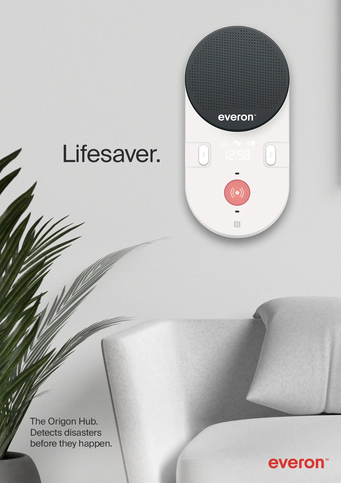
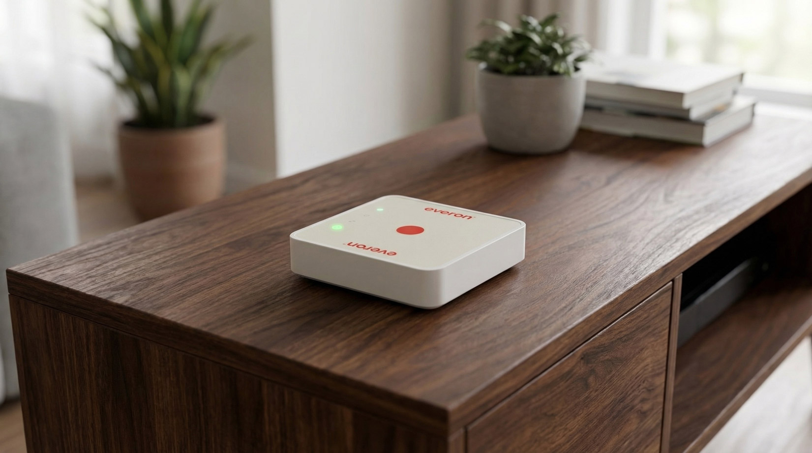
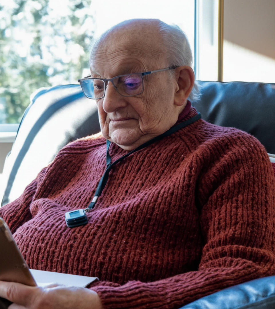
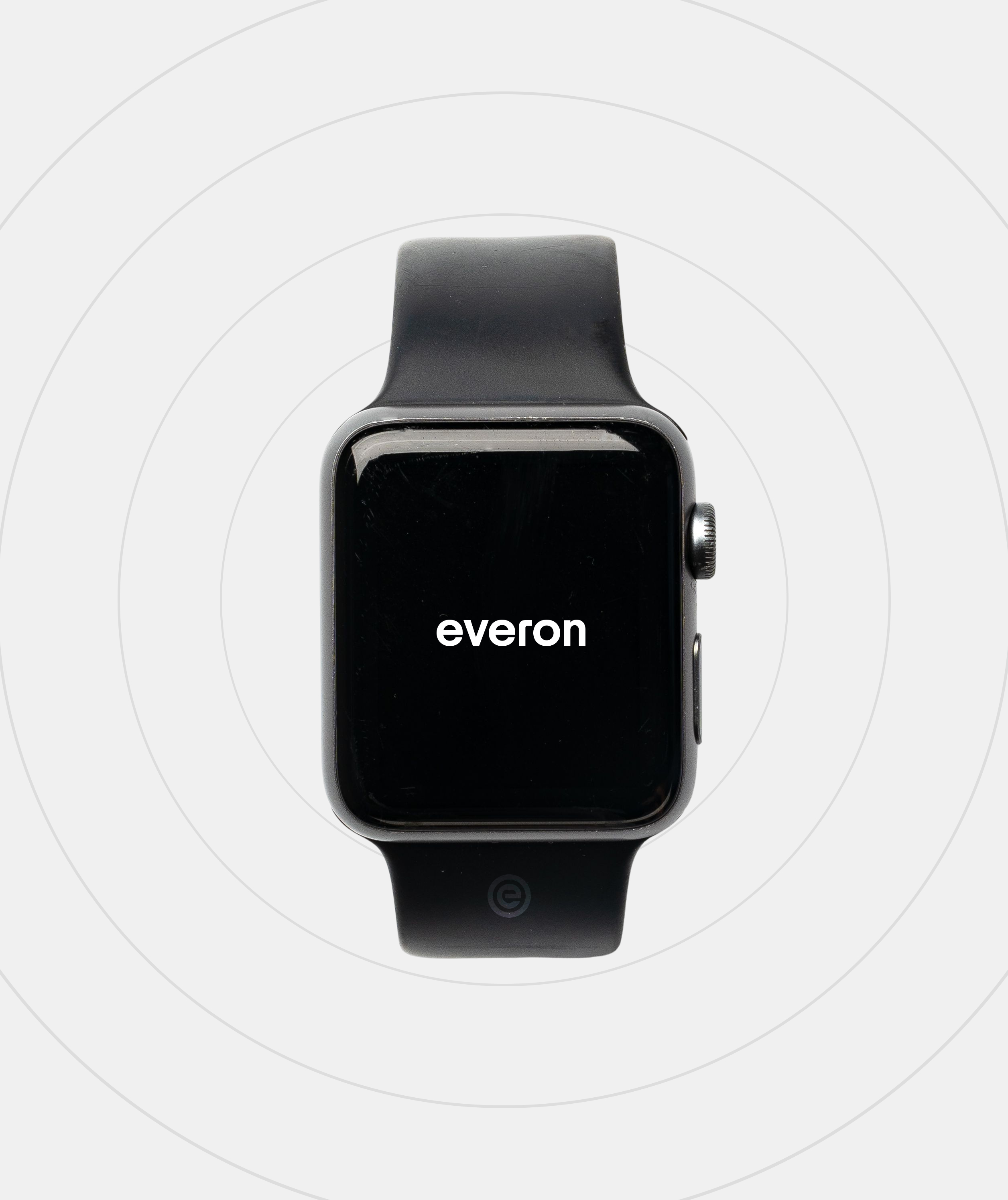
Everon™ Group is a European market leader in digital living solutions that enhance human life. An ecosystem of fall detectors, alarm systems, sleep sensors, wearables, and daily living monitors, is combined with intelligent data to allow the elderly and people with disability to live a safe and independent life.
Nephew partnered with Everon™ to reposition the brand across the pan-European organisation, from a siloed product-focused vendor to an integrated outcomes orientated solutions partner.
Nephew partnered with Everon™ to reposition the brand across the pan-European organisation, from a siloed product-focused vendor to an integrated outcomes orientated solutions partner.
At the heart of care.
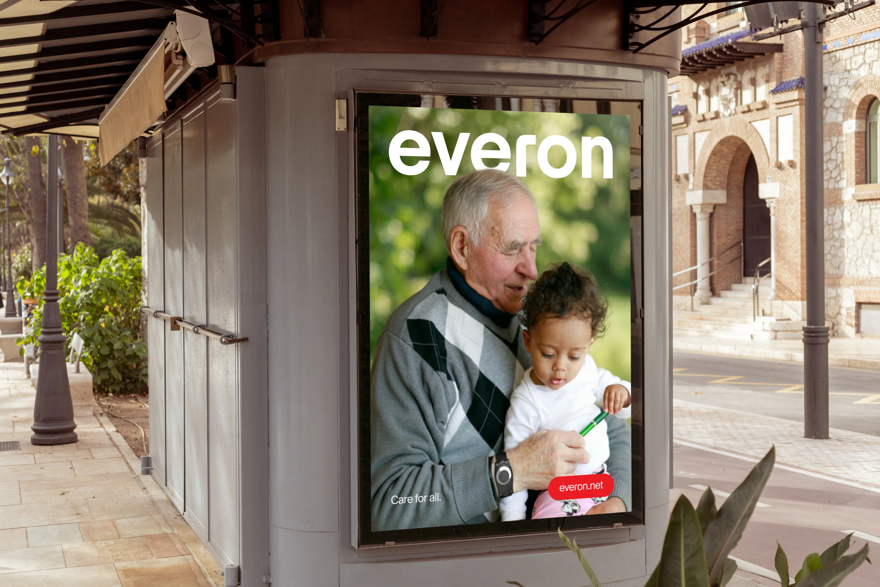
The beating heart of Everon™ is a mission to make life better for everyone, whether receiving care or delivering it. The beating heart demonstrates their passion and ferocity for individual independence.
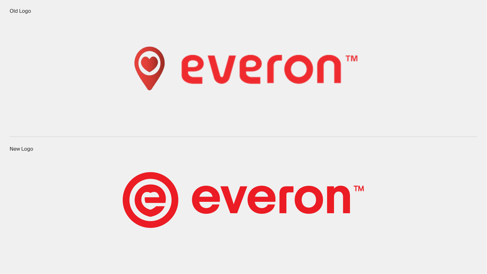
The old logo tried to embody this feeling, but was ageing fast and needed an upgrade.
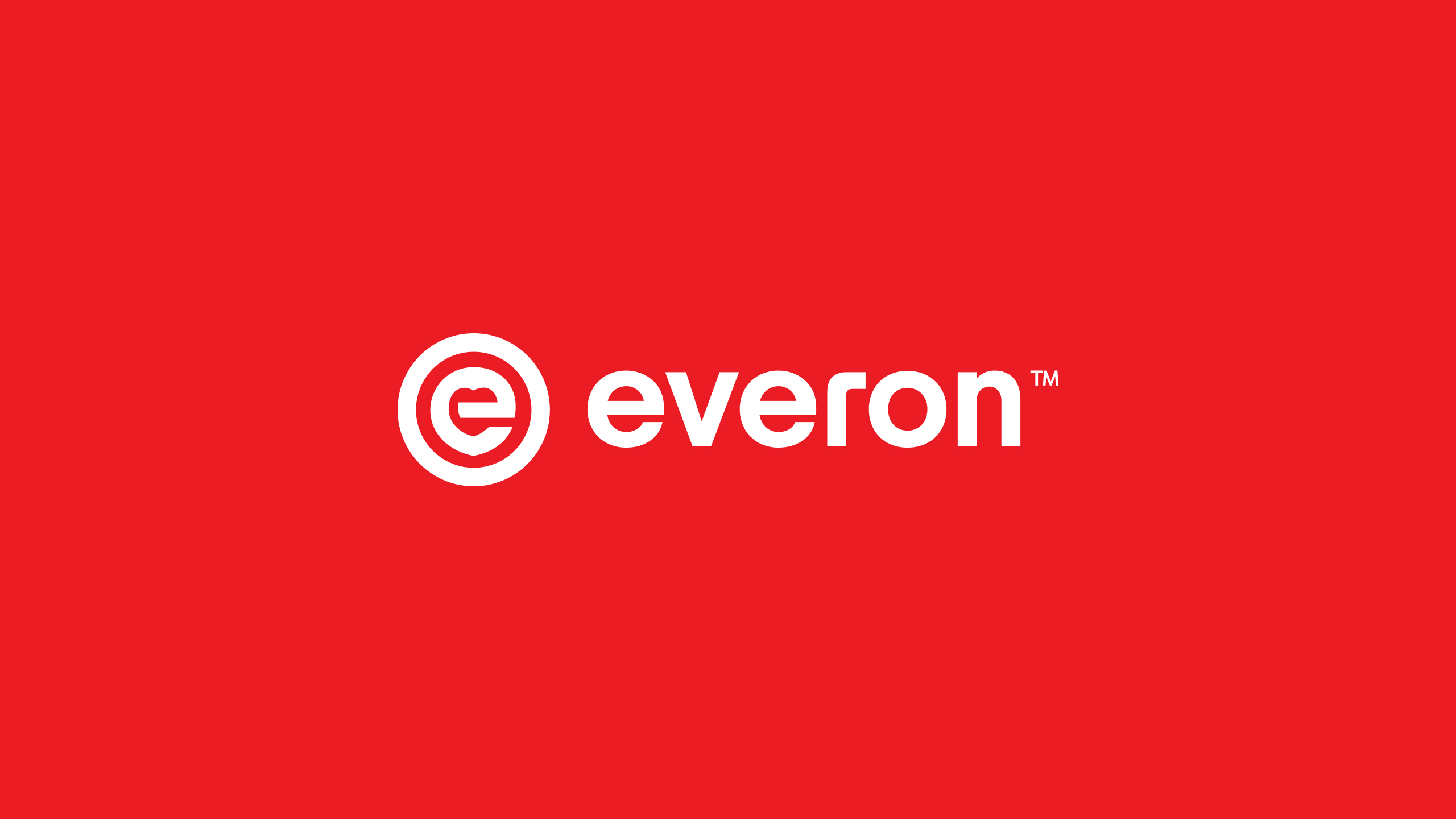
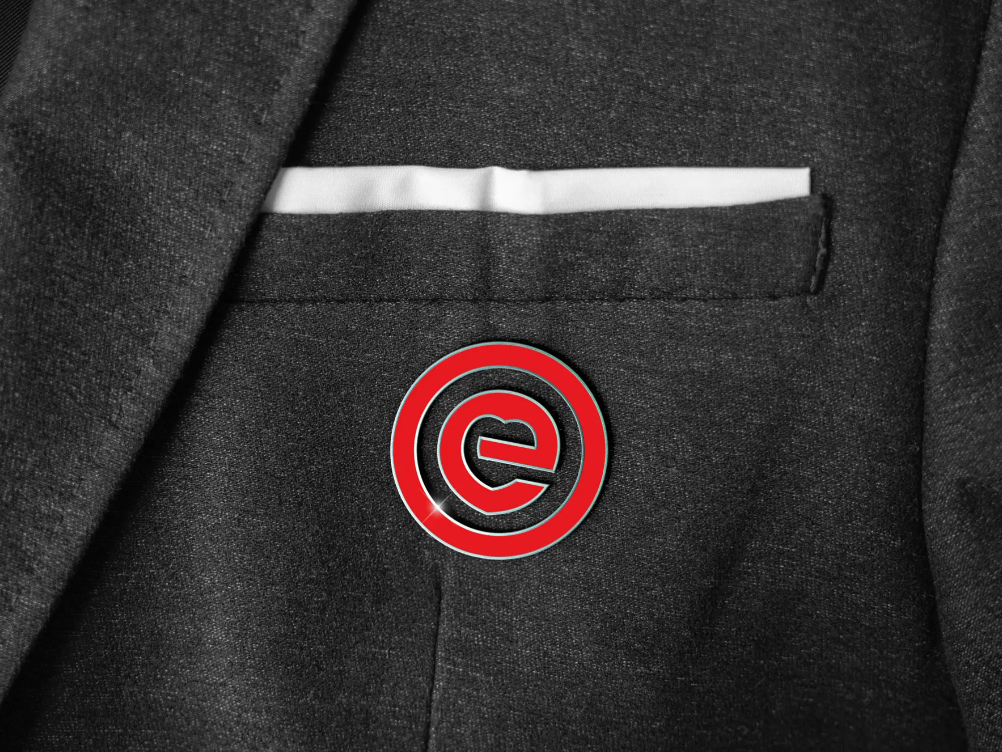
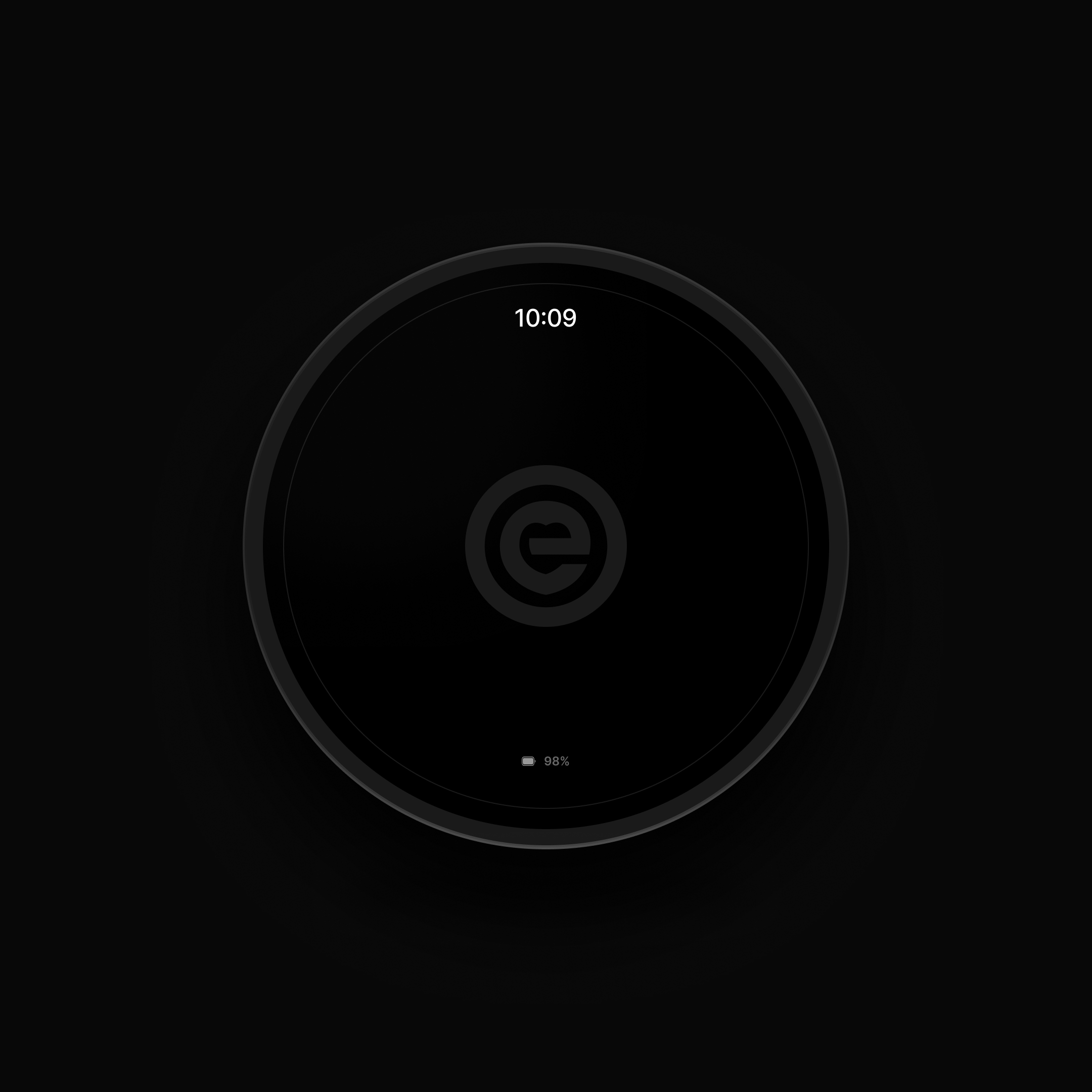
We recrafted the existing mark to form a new logo made of three purposeful elements: a customised letter 'e' containing a sharp lower vertex, resembling a place pin, to represent home and a sense of belonging; a heart hidden inside the counter of the 'e' to demonstrate Everon's love and passion for care; a circular container that holds everything together and emphasising 'care for all'.
In support is a new and improved wordmark. A new style for a modern world with improved geometry, better consistency, and softer proportions.
The old logo tried to embody this feeling, but was ageing fast and needed an upgrade.
We recrafted the existing mark to form a new logo made of three purposeful elements: a customised letter 'e' containing a sharp lower vertex, resembling a place pin, to represent home and a sense of belonging; a heart hidden inside the counter of the 'e' to demonstrate Everon's love and passion for care; a circular container that holds everything together and emphasising 'care for all'.
In support is a new and improved wordmark. A new style for a modern world with improved geometry, better consistency, and softer proportions.
Embracing the Nordic character
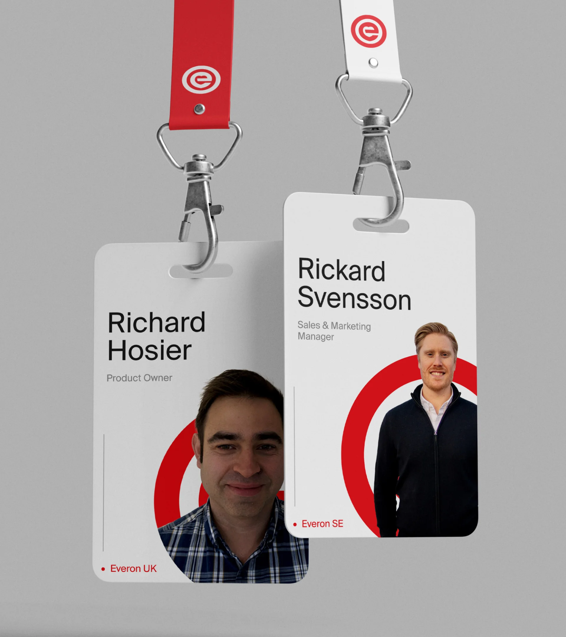
Originally founded in Finland, and with offices in Sweden and the UK, the northern European character and personality of the scandinavian culture heavily inspired the overall identity.
Minimalism, a sense of balance, and altruism is respected in the identity through the use of clear space, mathematical grid systems, and function over decoration.
On that basis, Suisse International is adopted as the workhorse typeface for the brand. Colour is also reduced to Everon's signature red and neutral greys, blacks and whites.
The Everon™ language is clear, direct and friendly; guiding people on how to best navigate the challenges of care.
Minimalism, a sense of balance, and altruism is respected in the identity through the use of clear space, mathematical grid systems, and function over decoration.
On that basis, Suisse International is adopted as the workhorse typeface for the brand. Colour is also reduced to Everon's signature red and neutral greys, blacks and whites.
The Everon™ language is clear, direct and friendly; guiding people on how to best navigate the challenges of care.
An experience grounded in trust
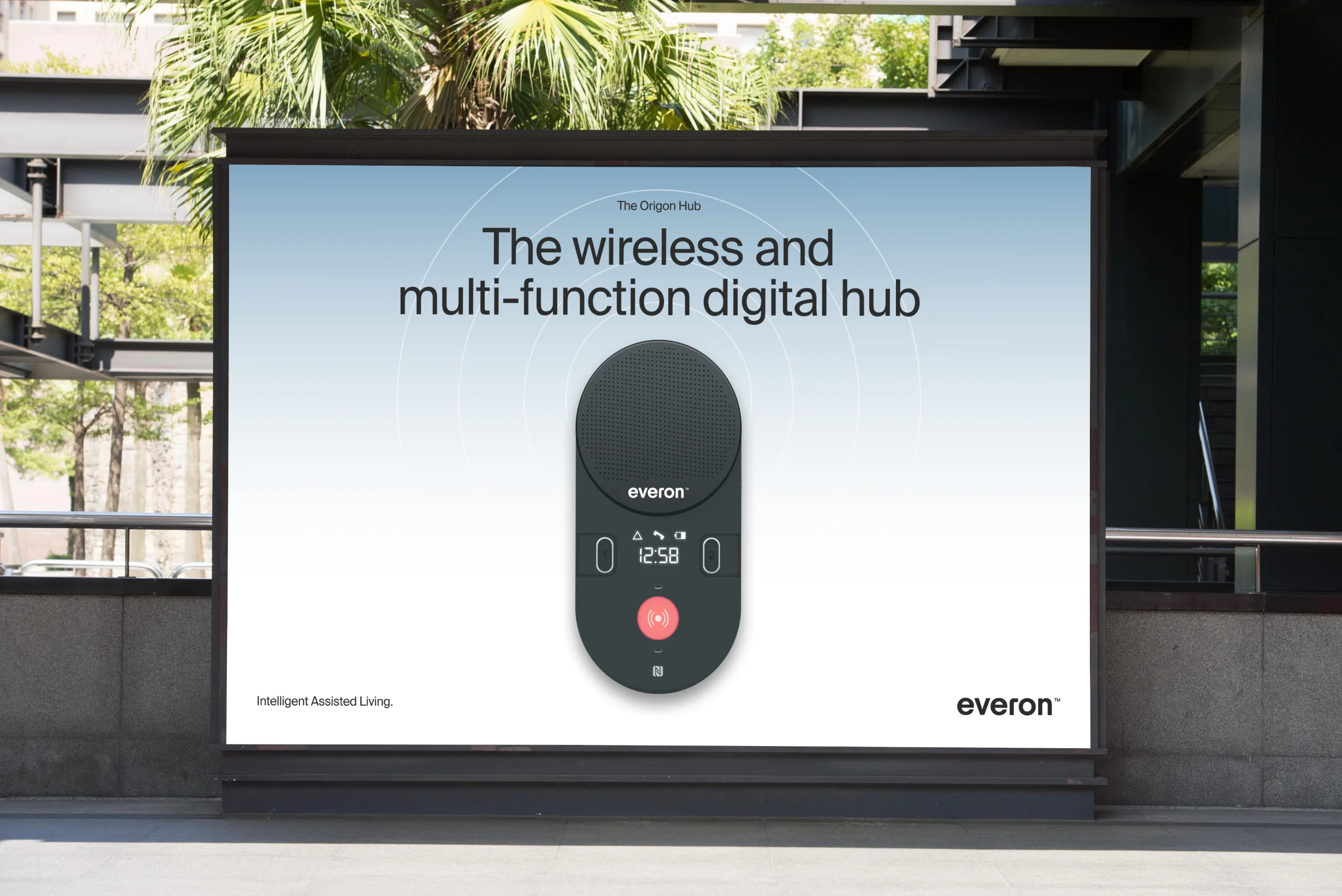
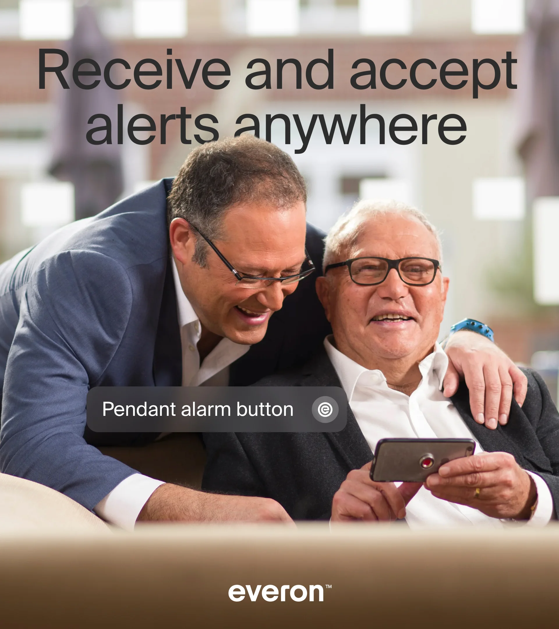
Our greatest challenge was to find a way to integrate multiple markets into a single cohesive 'one Everon™' that would function as a single brand experience.
Before the project, each territory functioned as silos under one brand name. Different systems, different customer websites. The new Everon™ is a single entity operating with the same voice under the same service delivery with a matching visual identity.
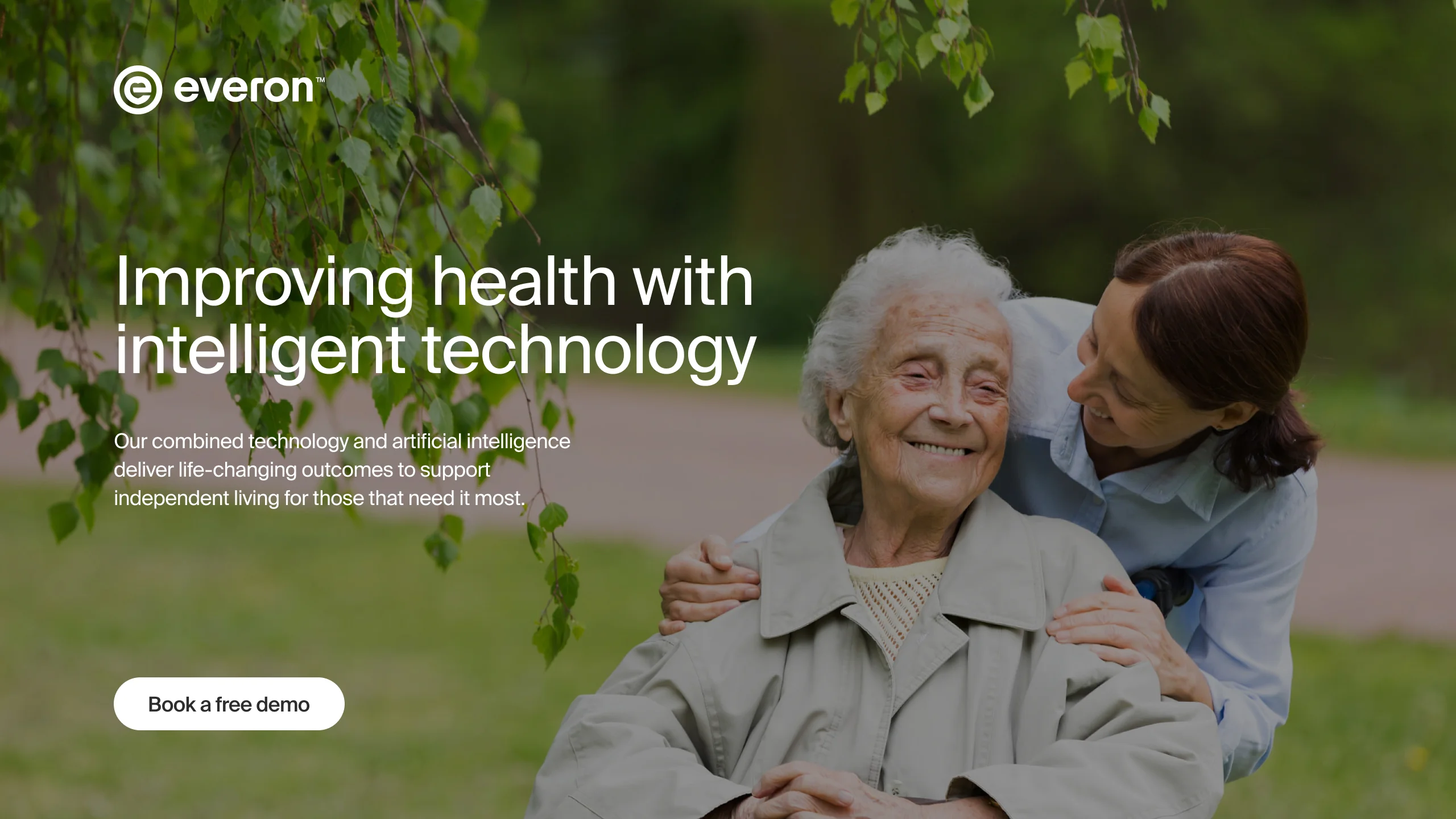
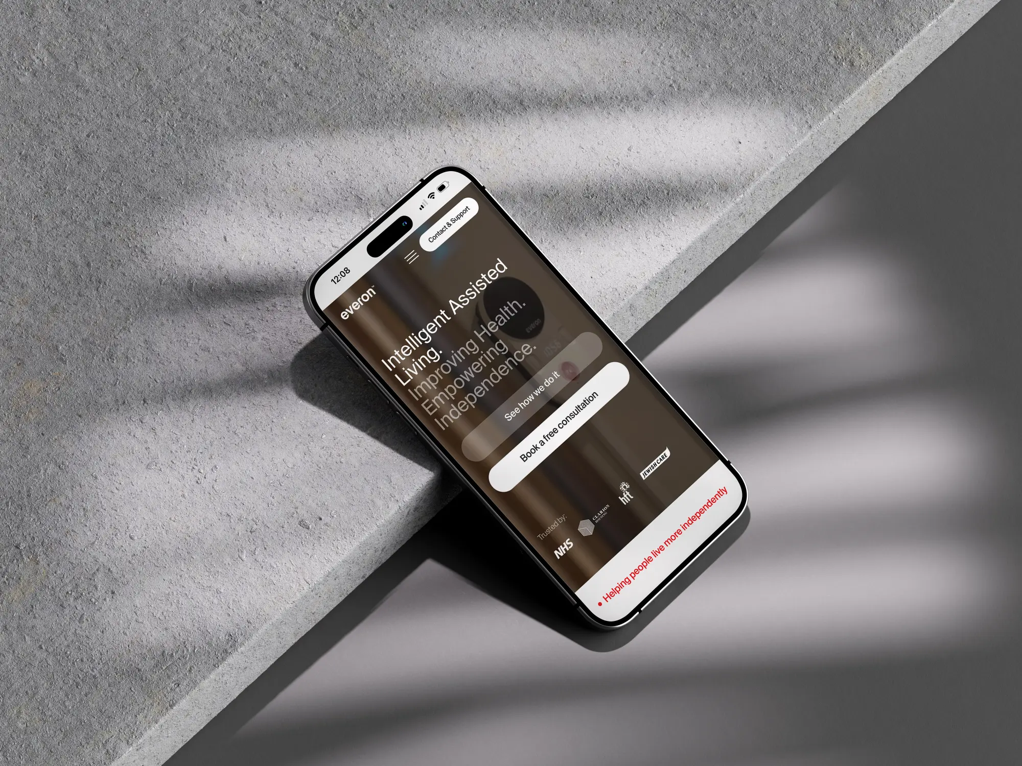
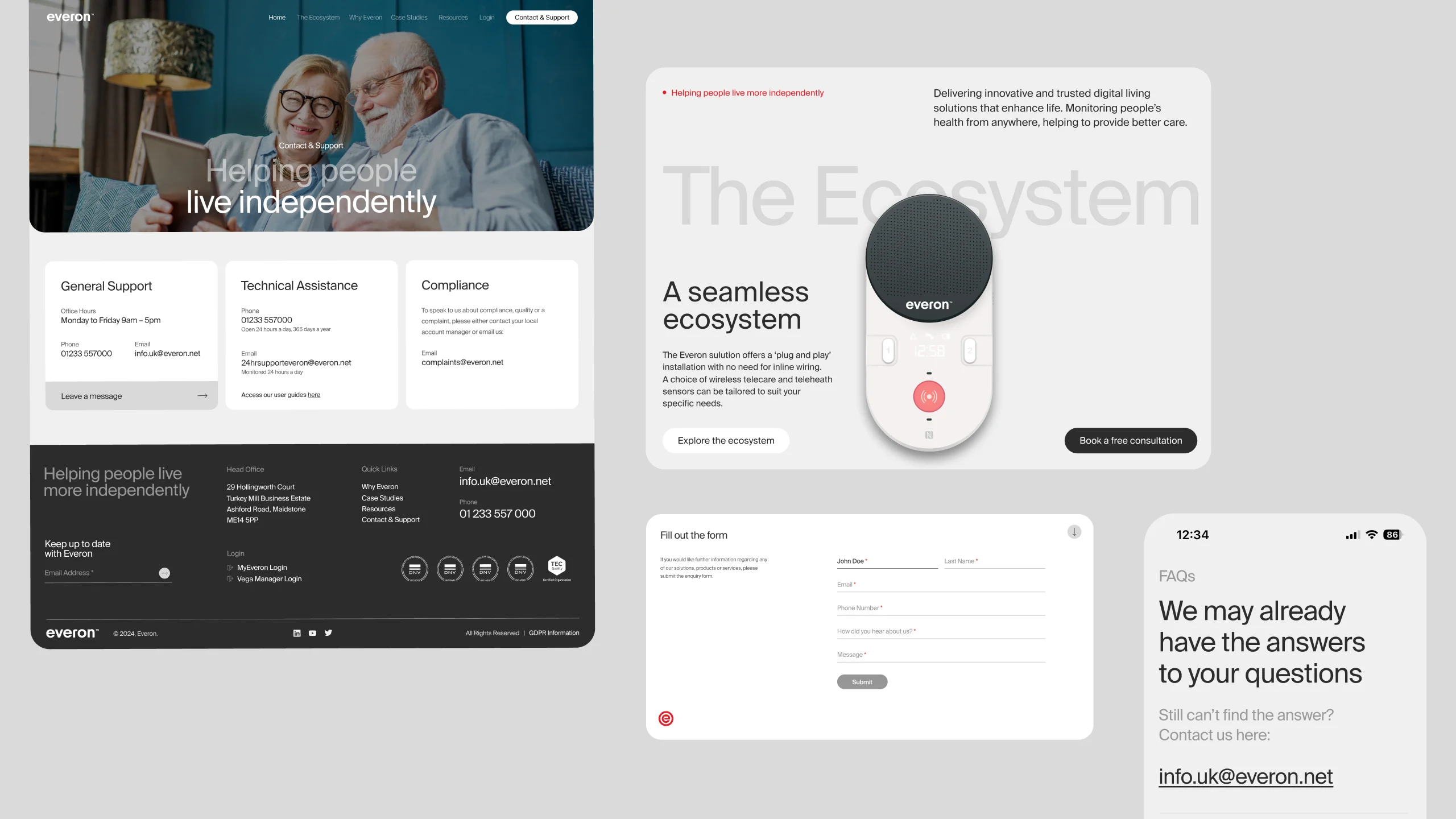
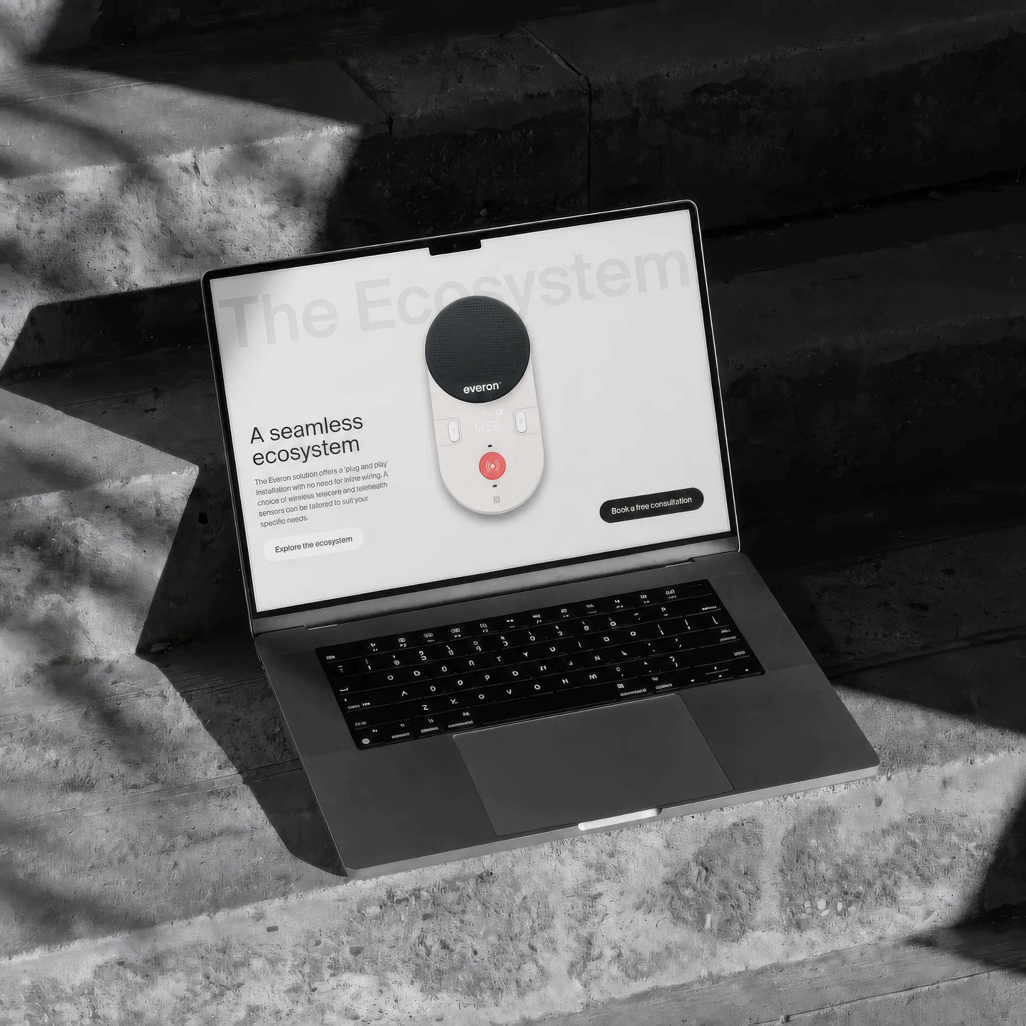
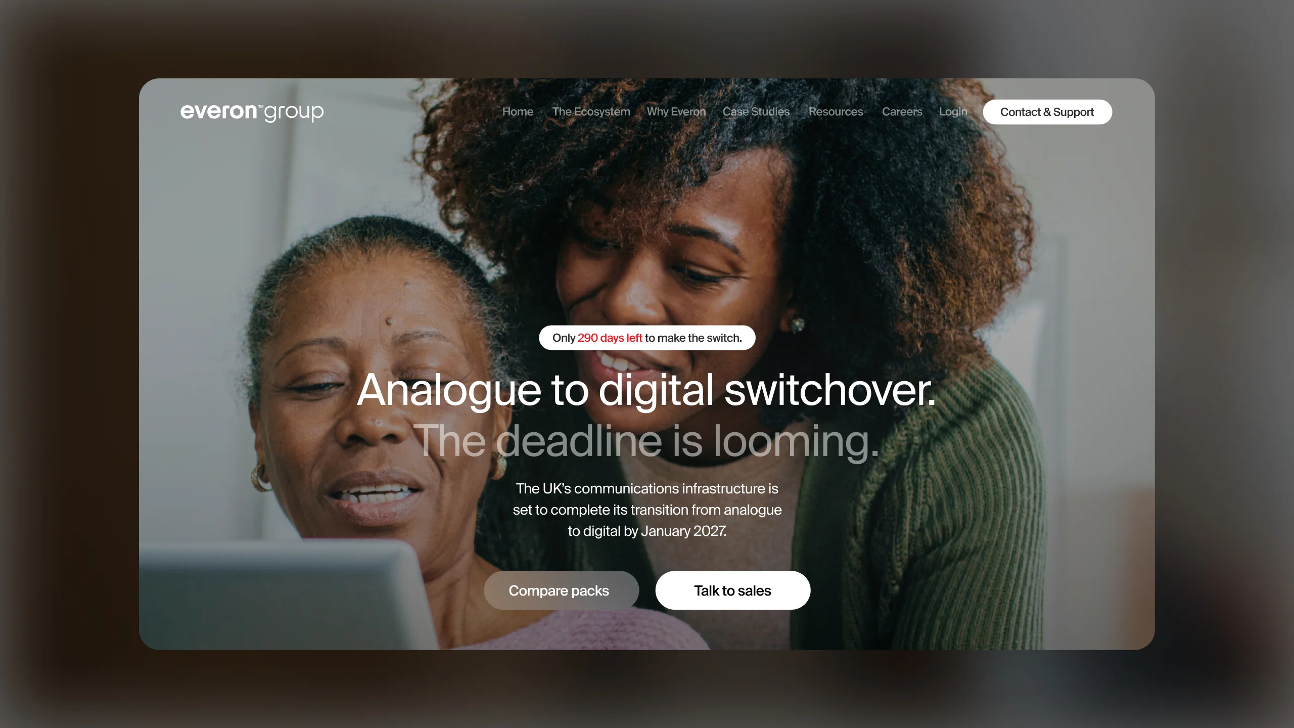
All three regional websites were merged into one containing geo-specific content and translated into all relevant market languages.
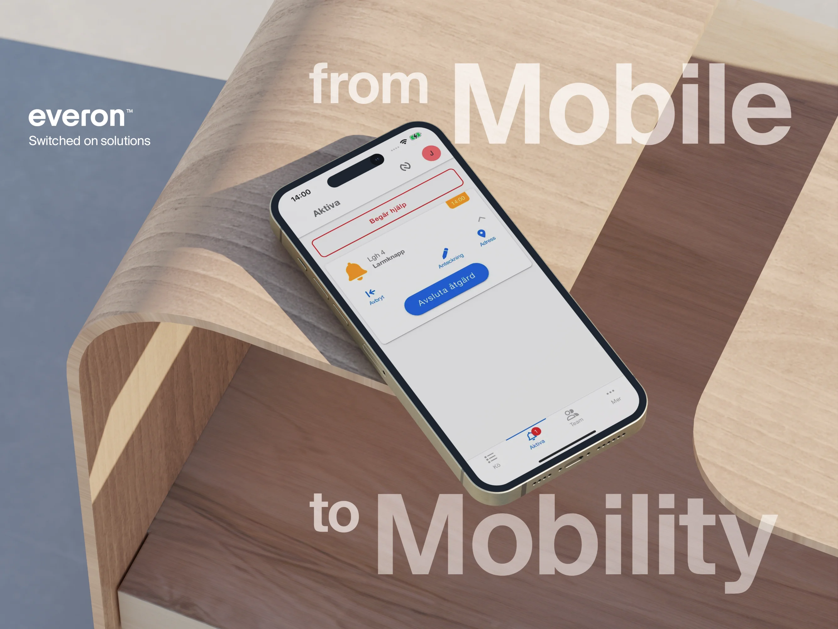
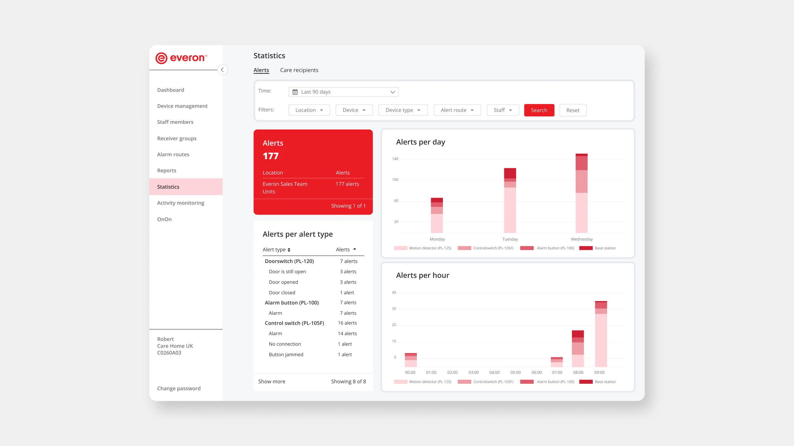
Systems became centralised and so too did data visualisation, user interface and user experience to create a design system that worked for each country, each market and each department. All done with the intent to build trust in the Everon™ service.
Before the project, each territory functioned as silos under one brand name. Different systems, different customer websites. The new Everon™ is a single entity operating with the same voice under the same service delivery with a matching visual identity.
All three regional websites were merged into one containing geo-specific content and translated into all relevant market languages.
Systems became centralised and so too did data visualisation, user interface and user experience to create a design system that worked for each country, each market and each department. All done with the intent to build trust in the Everon™ service.


.svg)


