Faith in the Future
Scroll
services provided
Brand Strategy
Visual Identity
Messaging & Comms
Web Design & Dev
WordPress CMS
Hosting & Security
Live site
Community. Faith. Spirit.
Holy Trinity School (HTS) is a Church of England Secondary, based in Crawley, West Sussex. Situated at the crossroads between competing demographics, HTS serves a diverse catchment area with many different ethnicities, lifestyles and, most importantly, faiths. With major redevelopment plans on the horizon and exciting new ambitions, the school leadership team felt it was time to rethink how the school represented itself to its 1,400 pupils and reaffirm its role in all parts of the community.
What's the big idea?
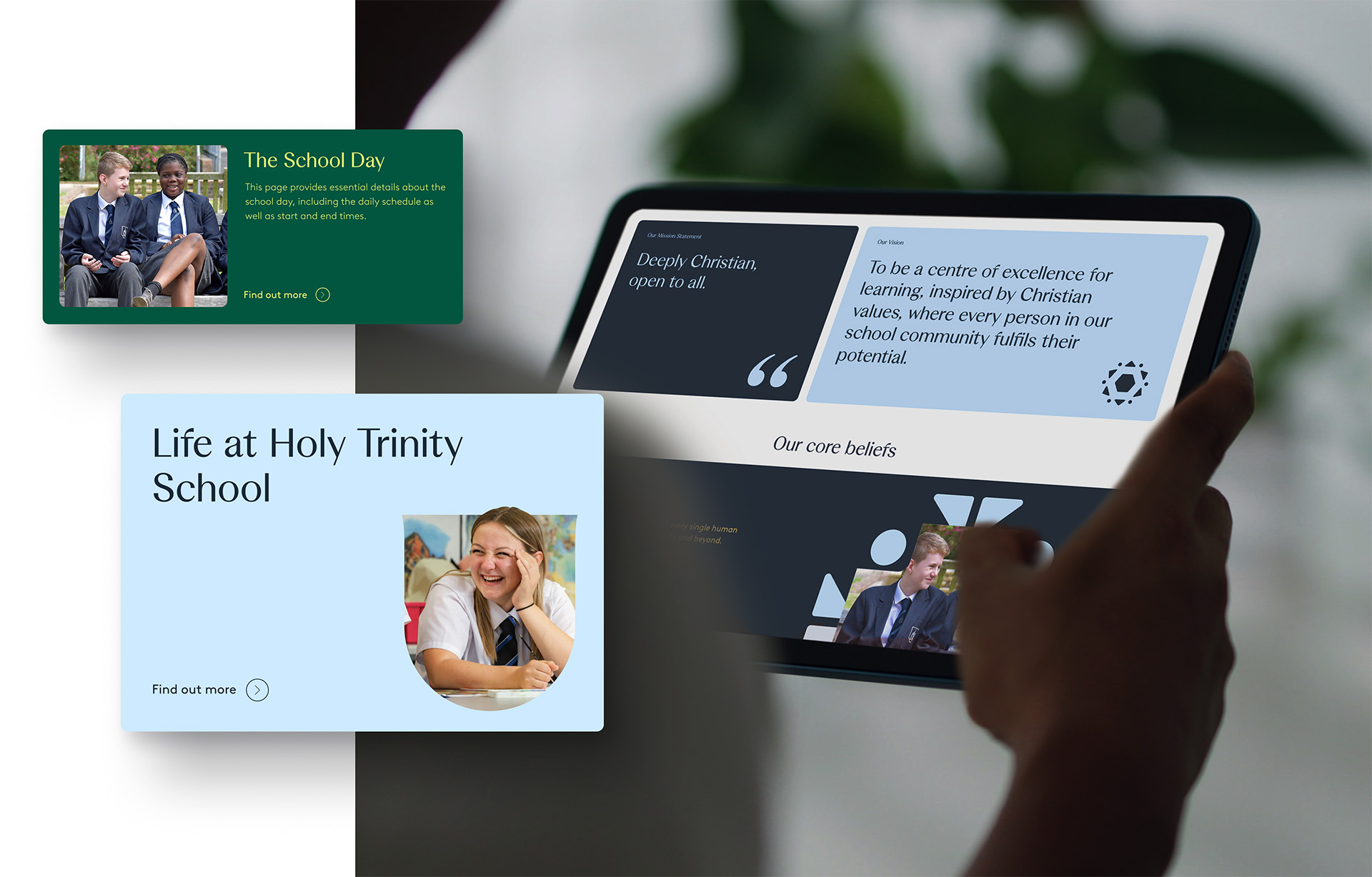
HTS is led by its ethos — ‘Deeply Christian, open to all’. A phrase that emphasises the school’s belief in Christian values applied to everyone, no matter their faith. The school’s vision is to be a centre of excellence for learning, where every individual in the school community fulfils their potential. Our aim was to unify these foundational principles into a single coherent message. From our perspective, there were two pivotal concepts to focus on: faith and future potential. So, we merged these two concepts together — ‘Faith in the Future - Education for tomorrow’s generation’ was born.
Before
The previous school mark was based on simplistic architectural illustrations of three buildings: Chichester Cathedral, St. Albans Church, and the school’s facade. This portrayed the relationship between HTS, the local parish Church of St. Albans in Gossop’s Green, and the Diocese of Chichester that supports the school. However, this mark had a shelf life. The school facade was soon to be replaced as part of the redevelopment plans. Within two years, the current identity would be rendered obsolete.
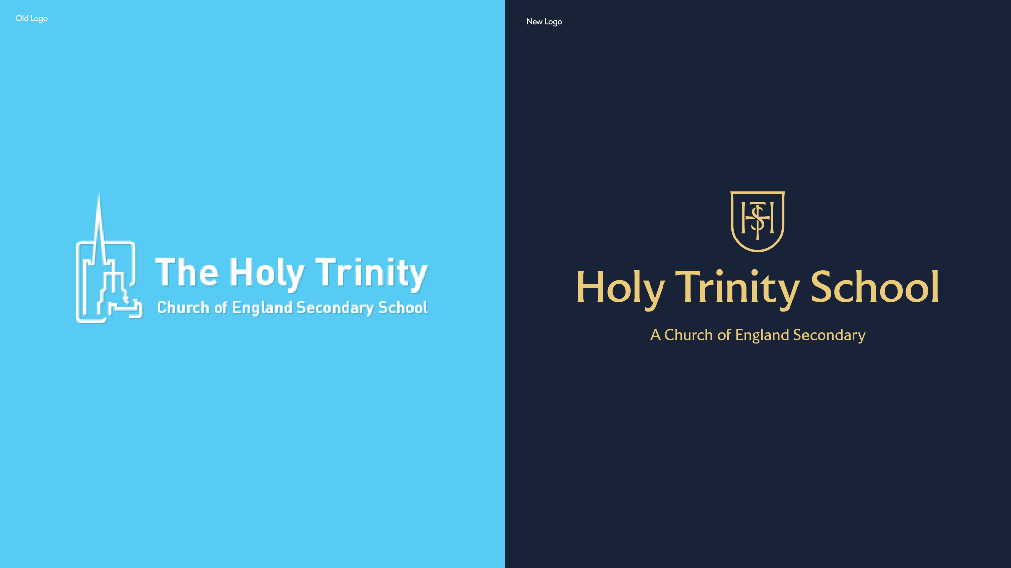
...and After
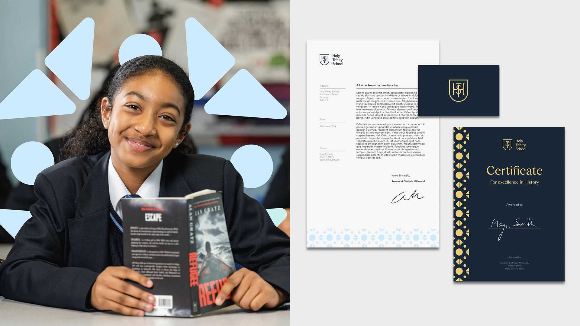
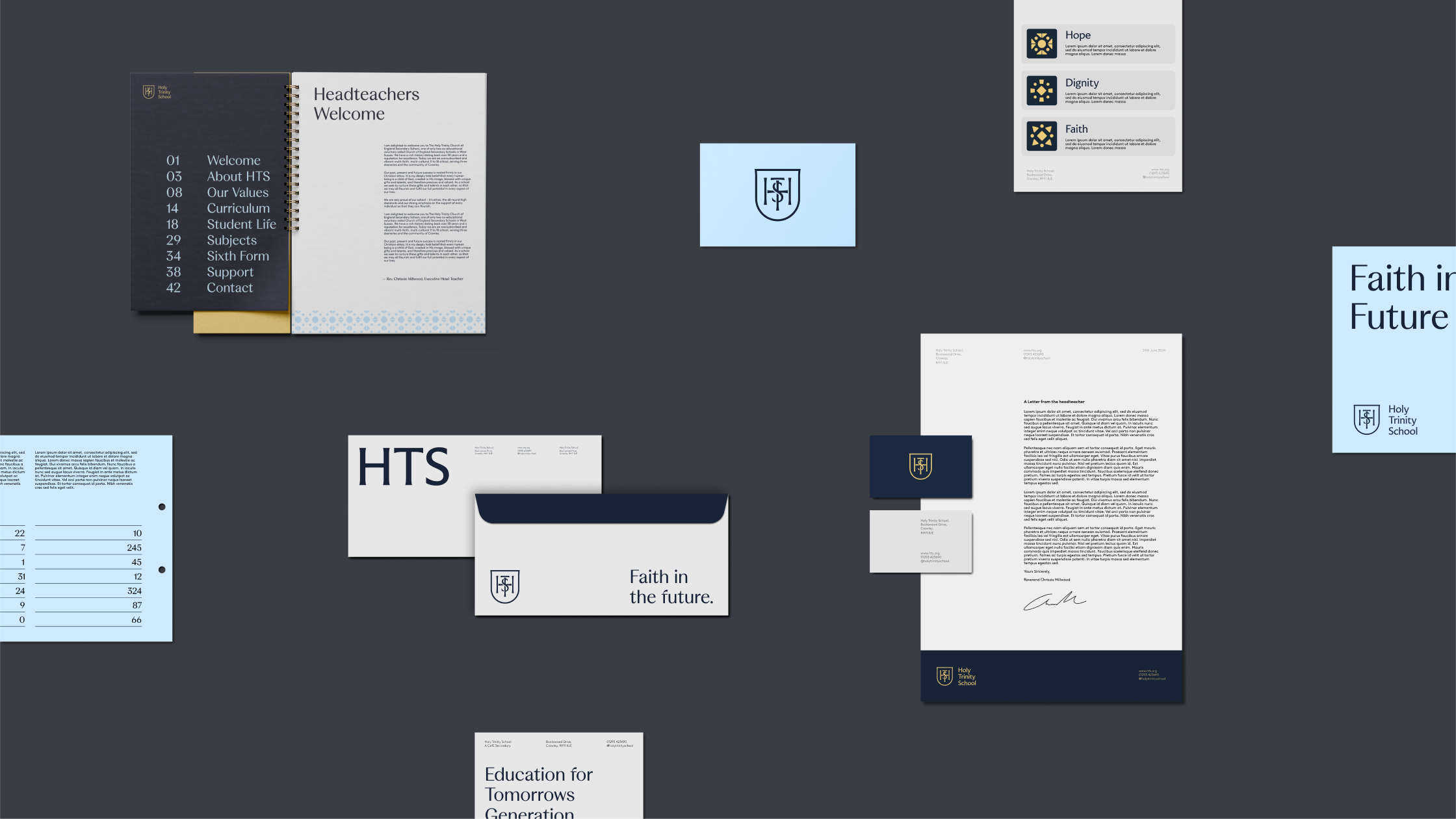
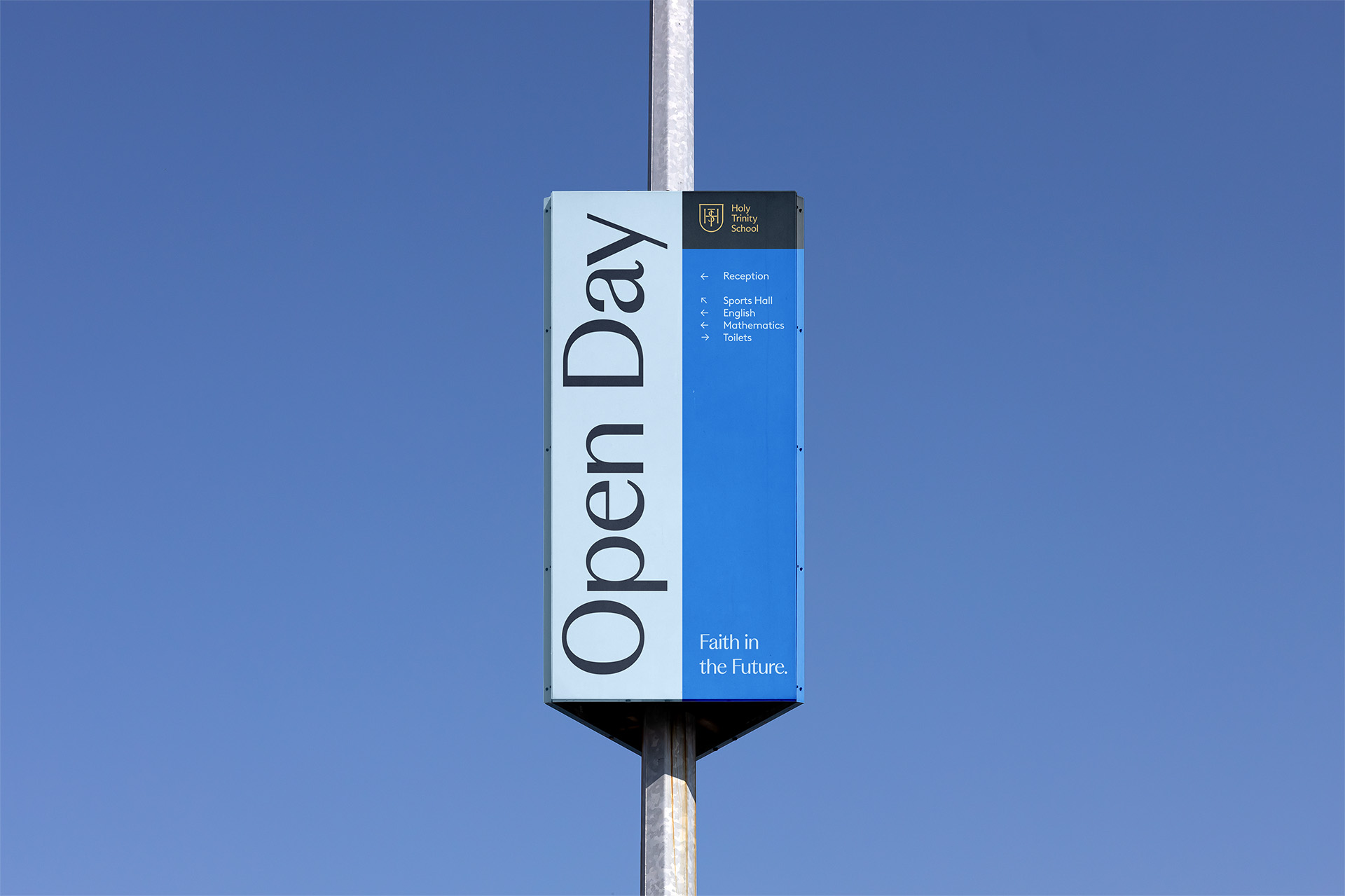
Our objective was to create an identity that felt unequivocally ‘HTS’ — merging christian roots with community co-operation; an optimistic future that excited the school body for what’s to come; and, most importantly, something they could own but share with everyone. The final mark was a thing of simplistic beauty — a monogram formed from the school’s initials, intertwined together to represent collaboration and community spirit. But at it’s core: the Christian cross, the quintessential hallmark of Christian values. Bound by a shield that creates a sense of protection and guardianship.
At exploration stage, we developed three distinct visual directions that revolved around the big ideas of faith, future, learning and sense of place. Each concept had its own theme that explored different facets of the big ideas. This was shared with the stakeholder team for immediate reaction and then left to percolate for more nuanced and considered feedback. Individual pieces of each concept resonated with the project team so a further round of development took place to create a merger of different ideas.
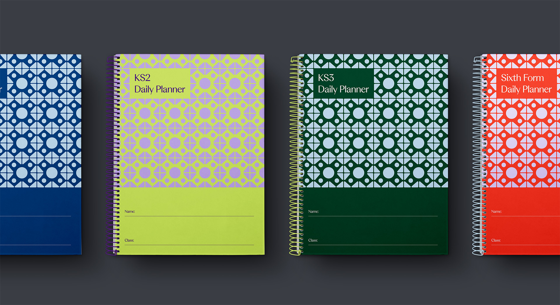
A kaleidoscope of learning
The new monogram stands as an emblem for the school’s positive future, but we also wanted to honour its past. This led us to look back towards the school’s links with supporting churches. Our deep-dive revealed some striking features — specifically a set of colourful stained-glass windows formed from simple geometric shapes, that seemed to traverse cultural symbols from different faiths. To us, it felt like looking through a beautiful kaleidoscope — a visual metaphor for the ever-changing mix of extensive learning on offer. Reproducing these shapes across the identity, as a visual device, enabled us to perfectly encapsulate all aspects of the multi-faith values of HTS, derived from something wholly Christian.
Fonts + Education = Challenge
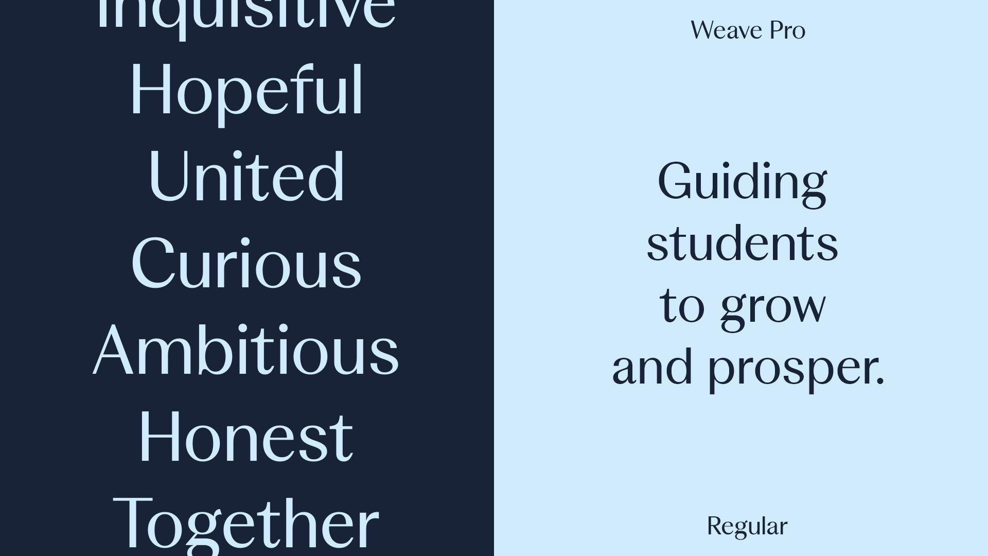
Often, pairing educational organisations with carefully considered and appropriate font choices can be a difficult task to master. With so many audiences to cater for, outdated IT systems, accessibility, and licensing challenges; schools usually turn to default system fonts for their daily use. Think Arial, think Calibri. We wanted better for HTS, insisting on obtaining a balance between utility and design.
Weave Pro Regular by Colophon Foundry was selected as the HTS signature typeface. Not quite a serif, not quite a sans-serif, it exhudes elegance and communicates heritage with high-contrast. Supporting Weave is Brown Regular by Lineto — a clean, spacious typeface that feels easy to read at any scale.
Together, the type system works to create a sense of trust, leadership and inclusion.
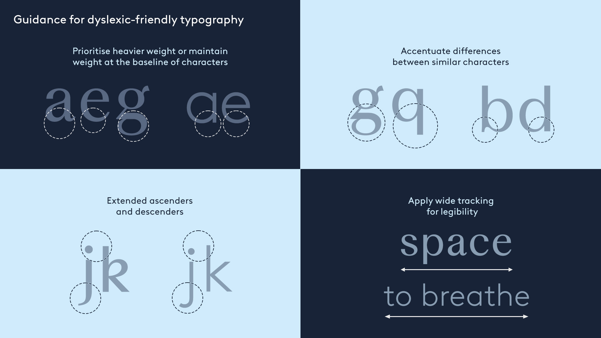
Before letting the ink dry on our type system, we underwent an accessibility check, particularly focused on the impact for dyslexic sufferers. Using academic papers and online research, we tested a wide-range of typefaces for acceptable markers such as contrast and legibility. Comparing these to well-known dyslexia-friendly options, Weave Pro and Brown passed our accessibility tests.
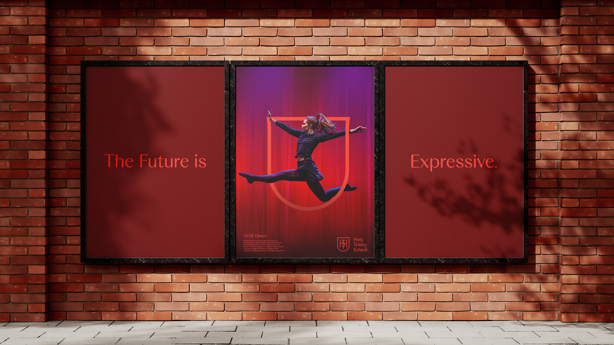
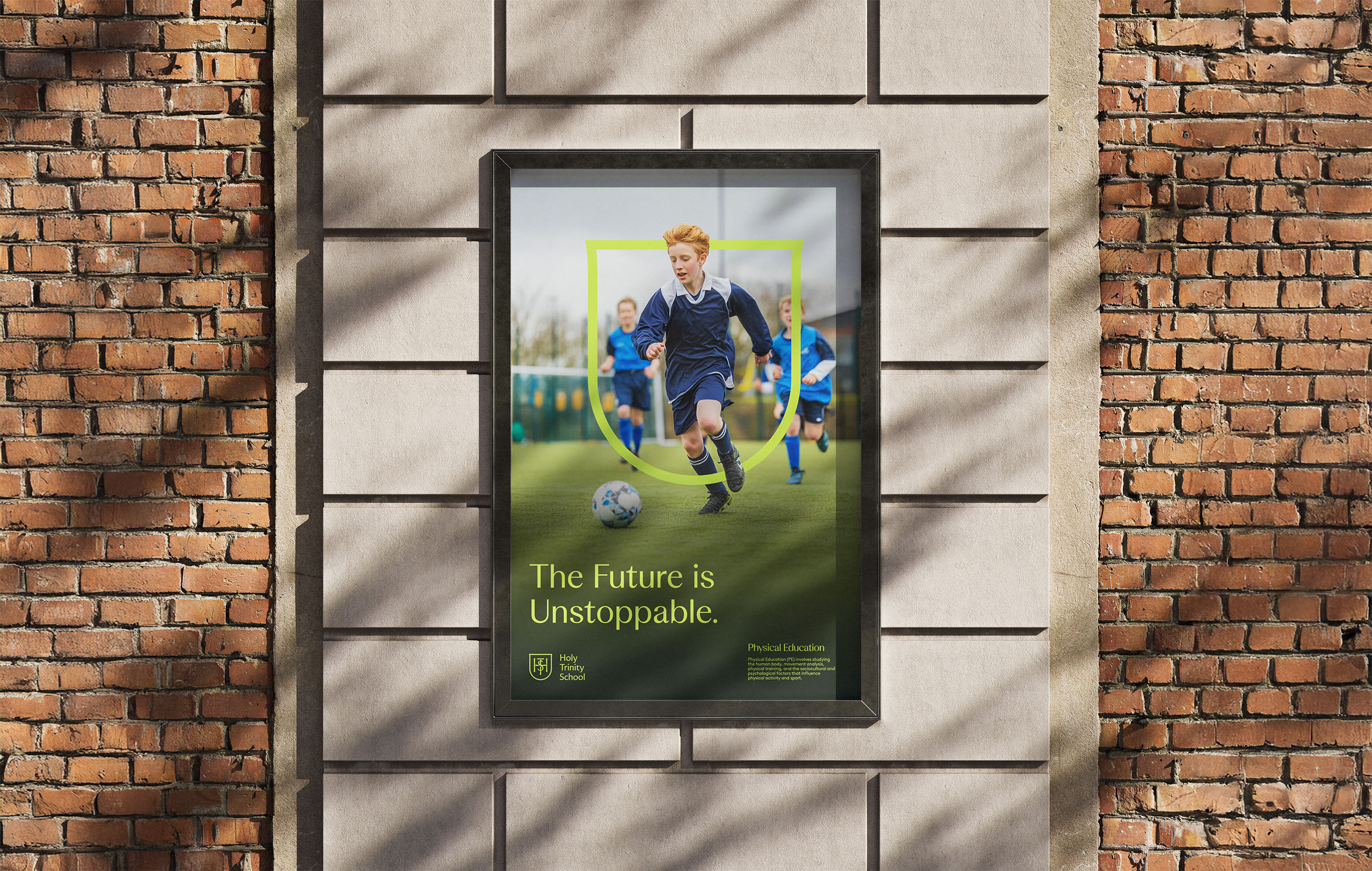
Express Yourself
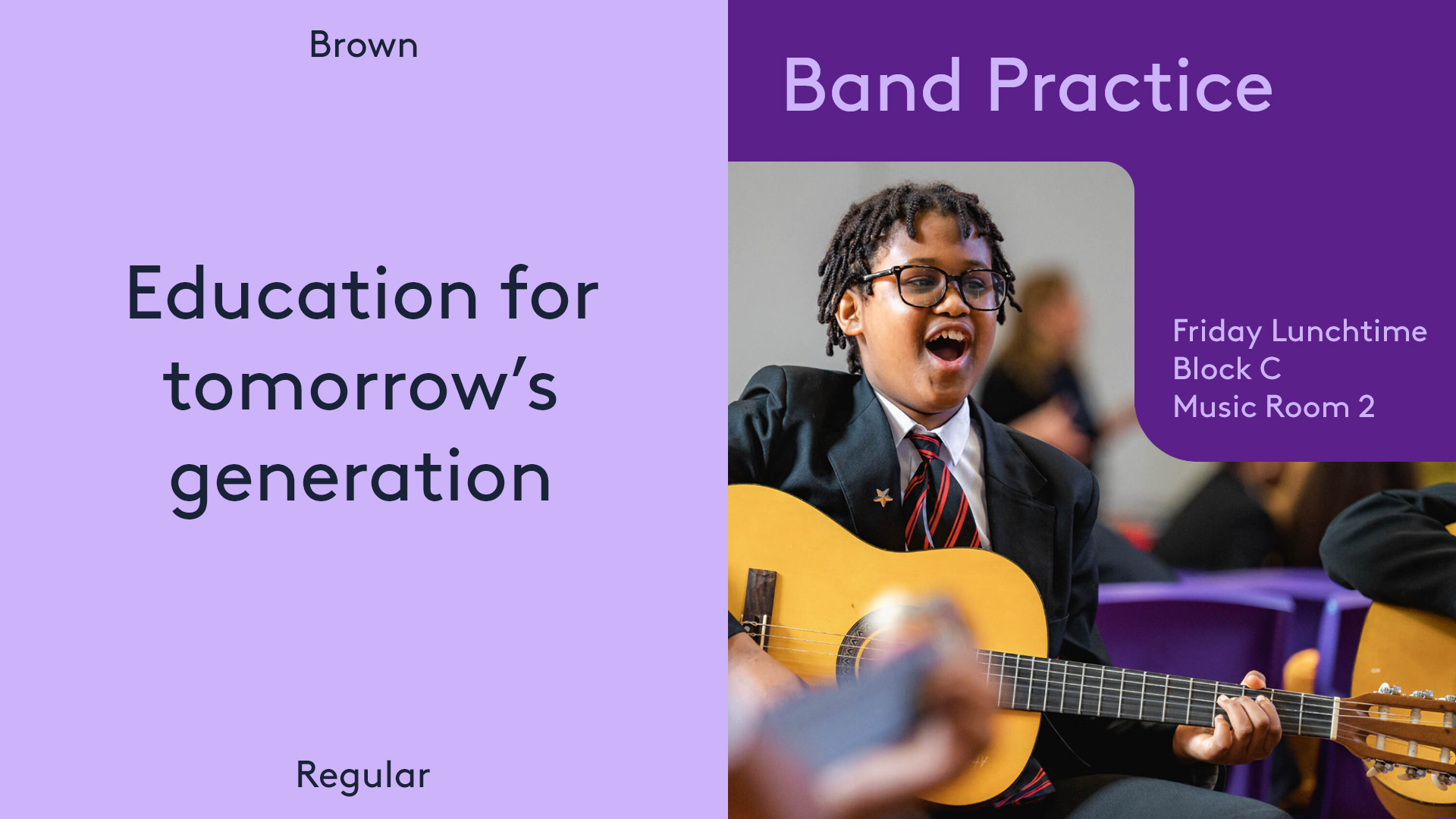
Colour is a key differentiator for schools. In any catchment area, schools can be marked out by a single colour. For HTS, the colour was blue. The new palette centres on three tones of blue — HTS Blue, Trinity Blue and Light Blue — with a new gold accent that adds a layer of prestige. Beyond the core colours, we developed a secondary palette for improved design flexibility and to allow for tonal expression. With such a broad set of demographics to cater for, the school has to communicate via many different voices. Using colour, imagery, and tone, we built a system that allowed for the school’s voice to range from joyful and full of zest to authoritative and principled.


.svg)


